Project scope
/ART DIRECTION
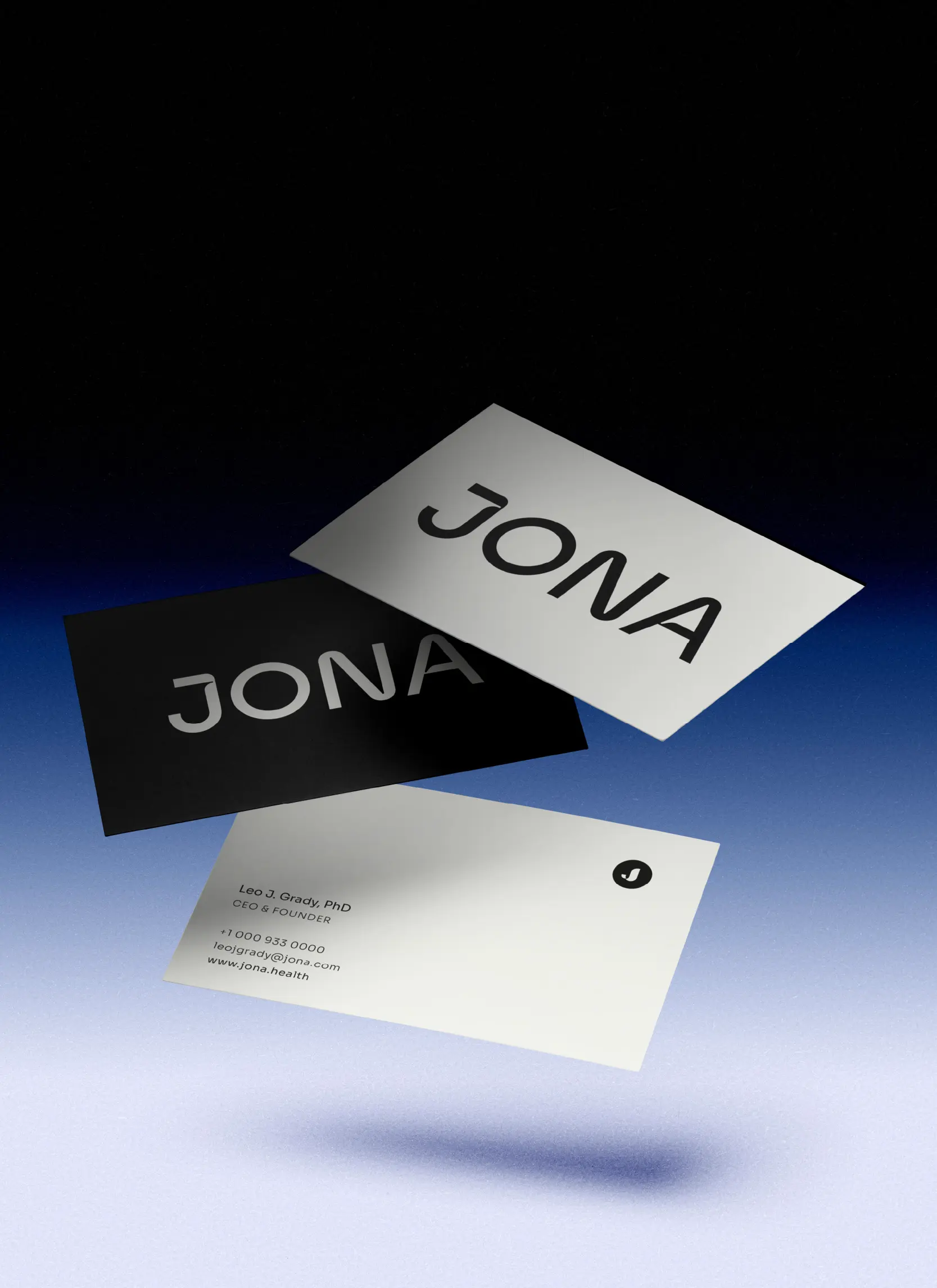
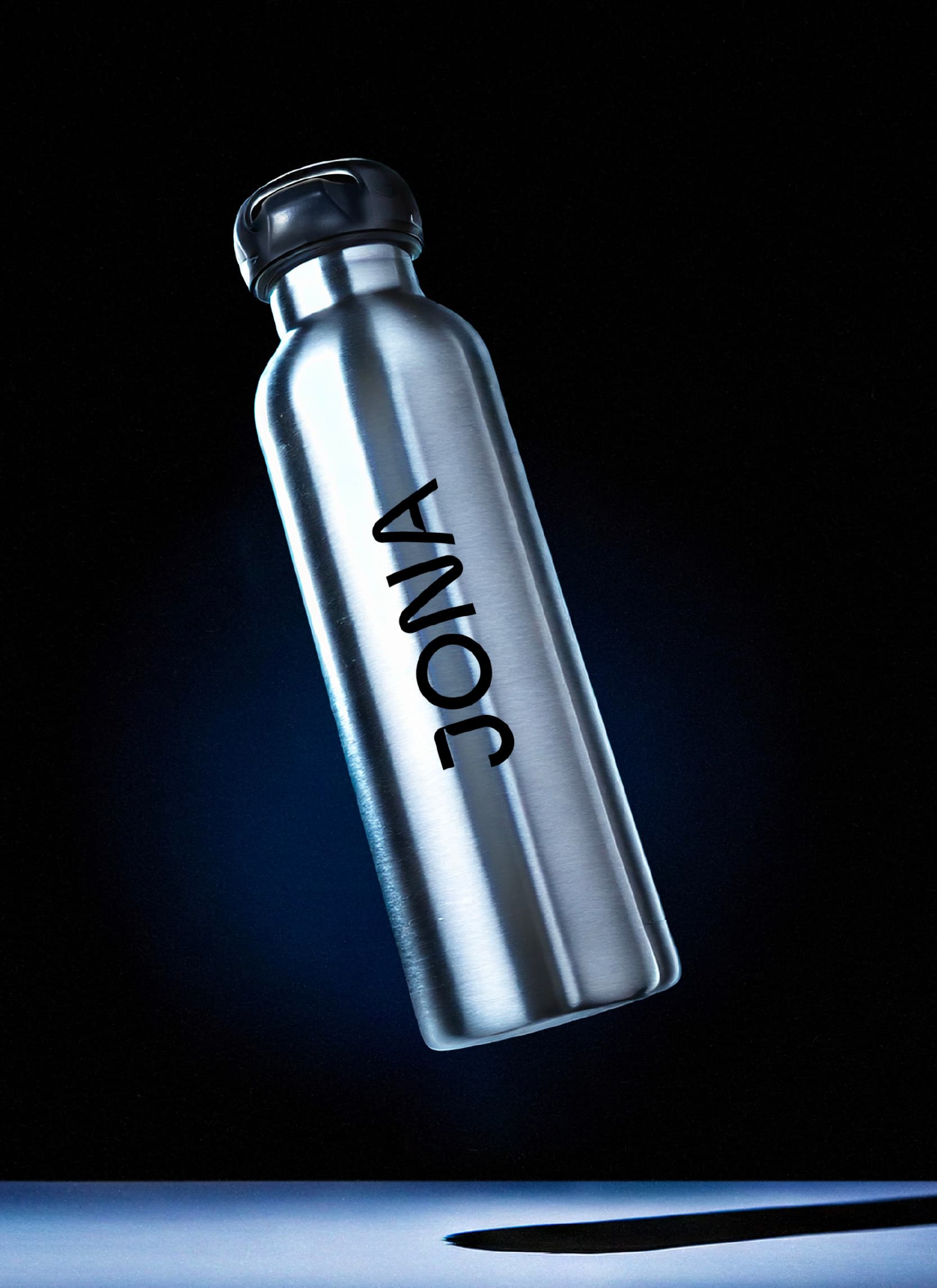
/BRAND SYSTEM
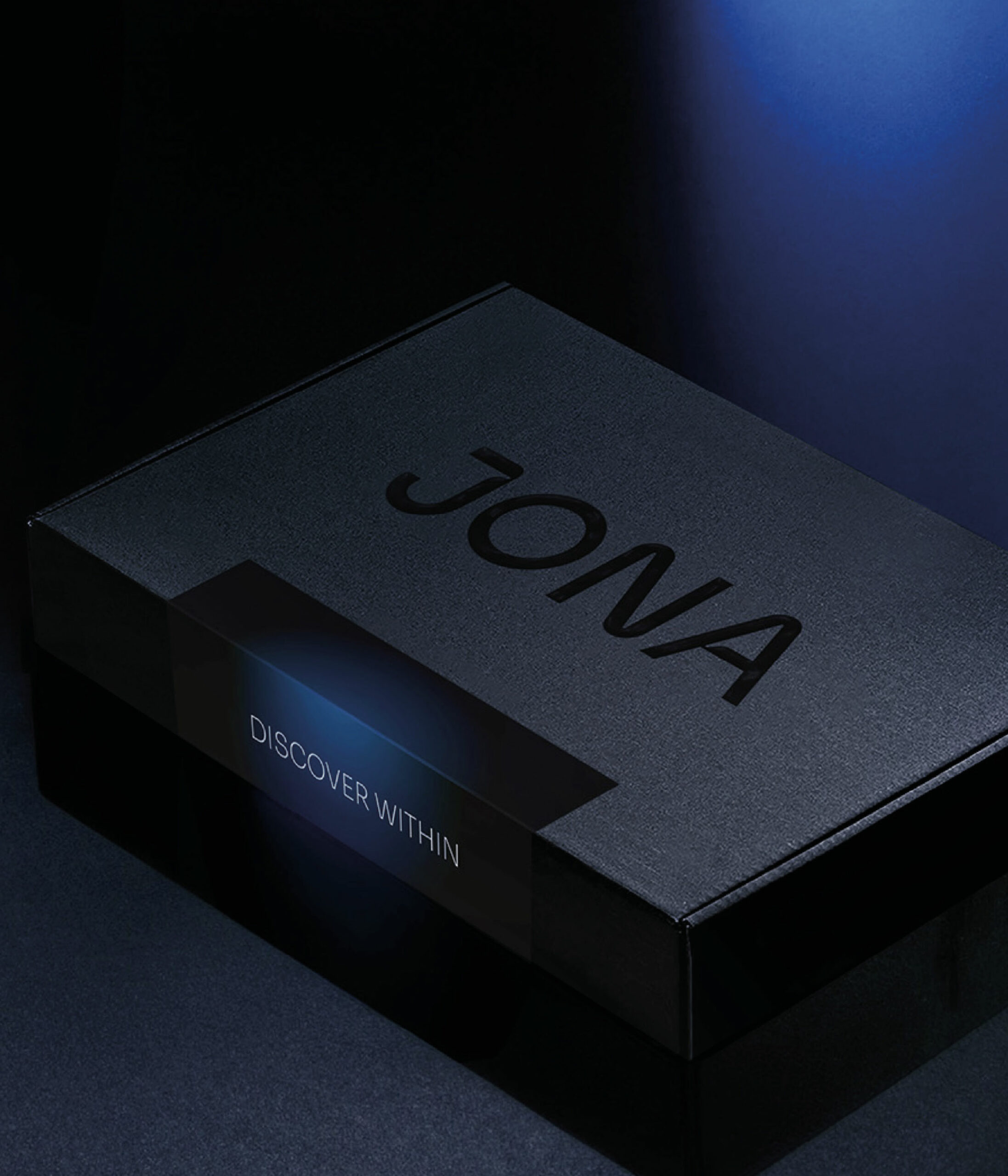
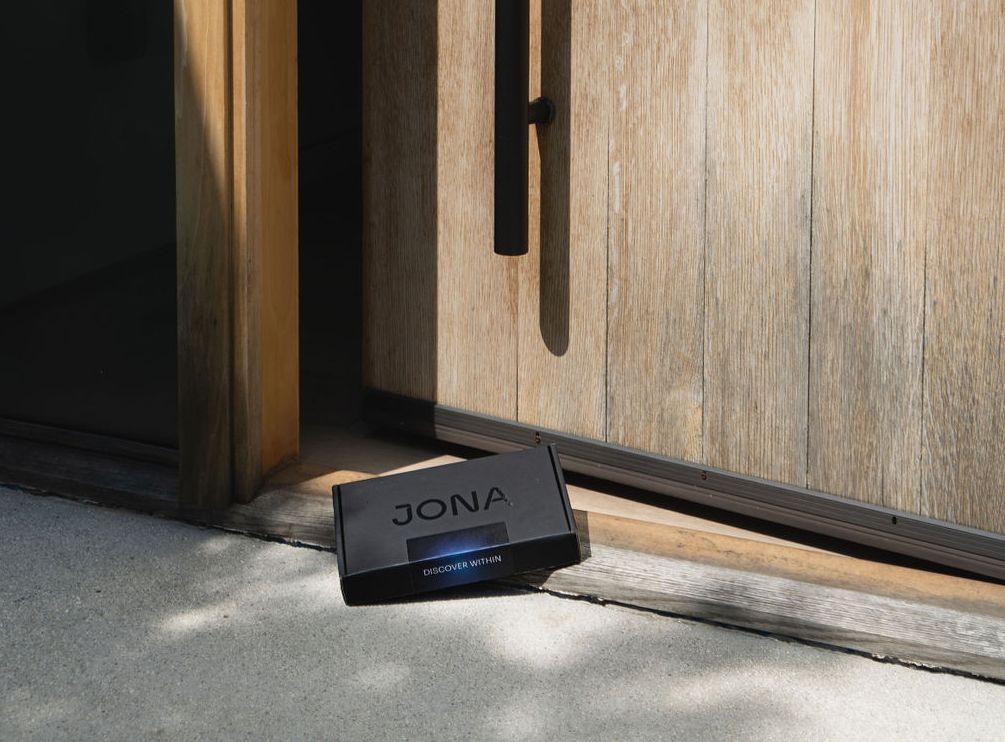
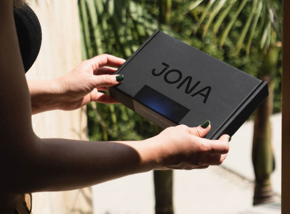
/PACKAGING
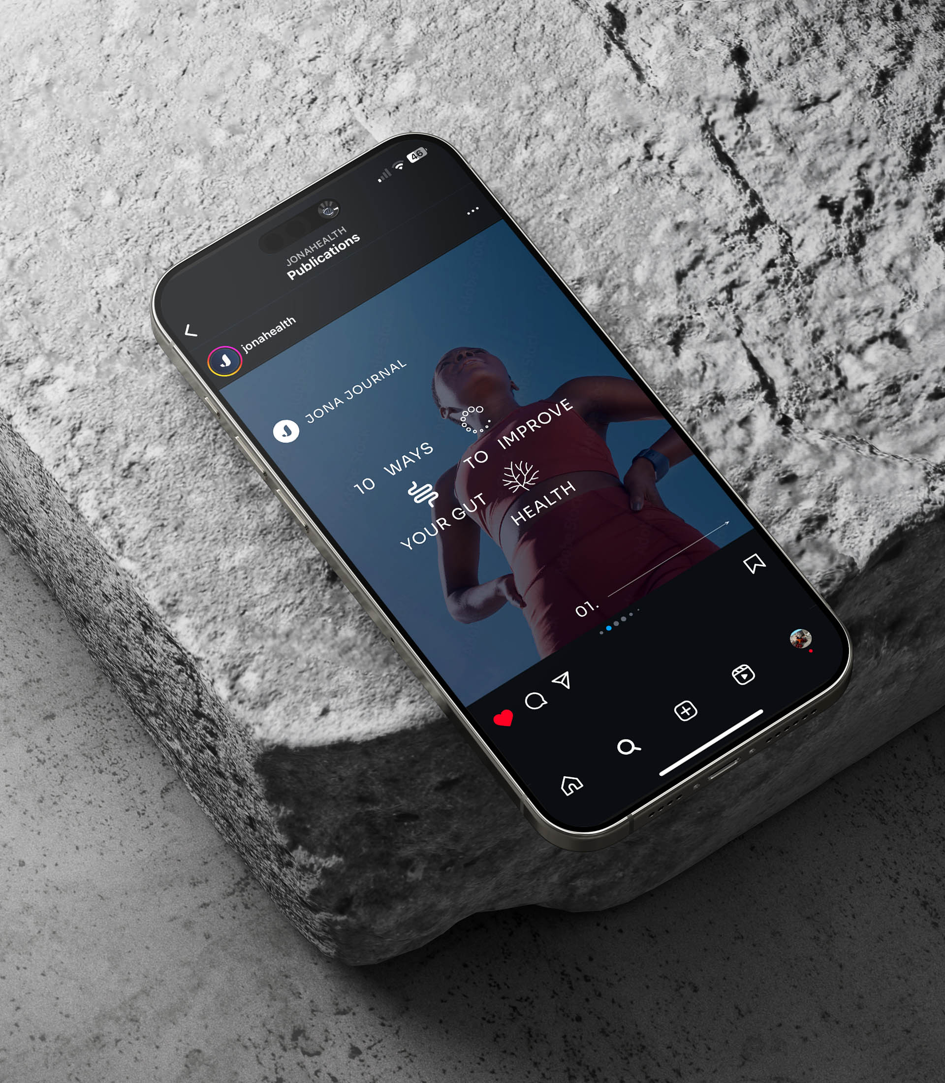
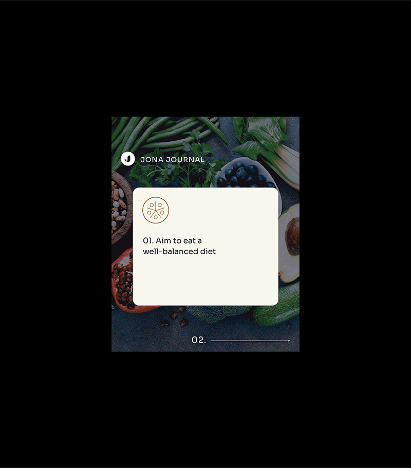
/DIGITAL CONTENT
/UI DESIGN

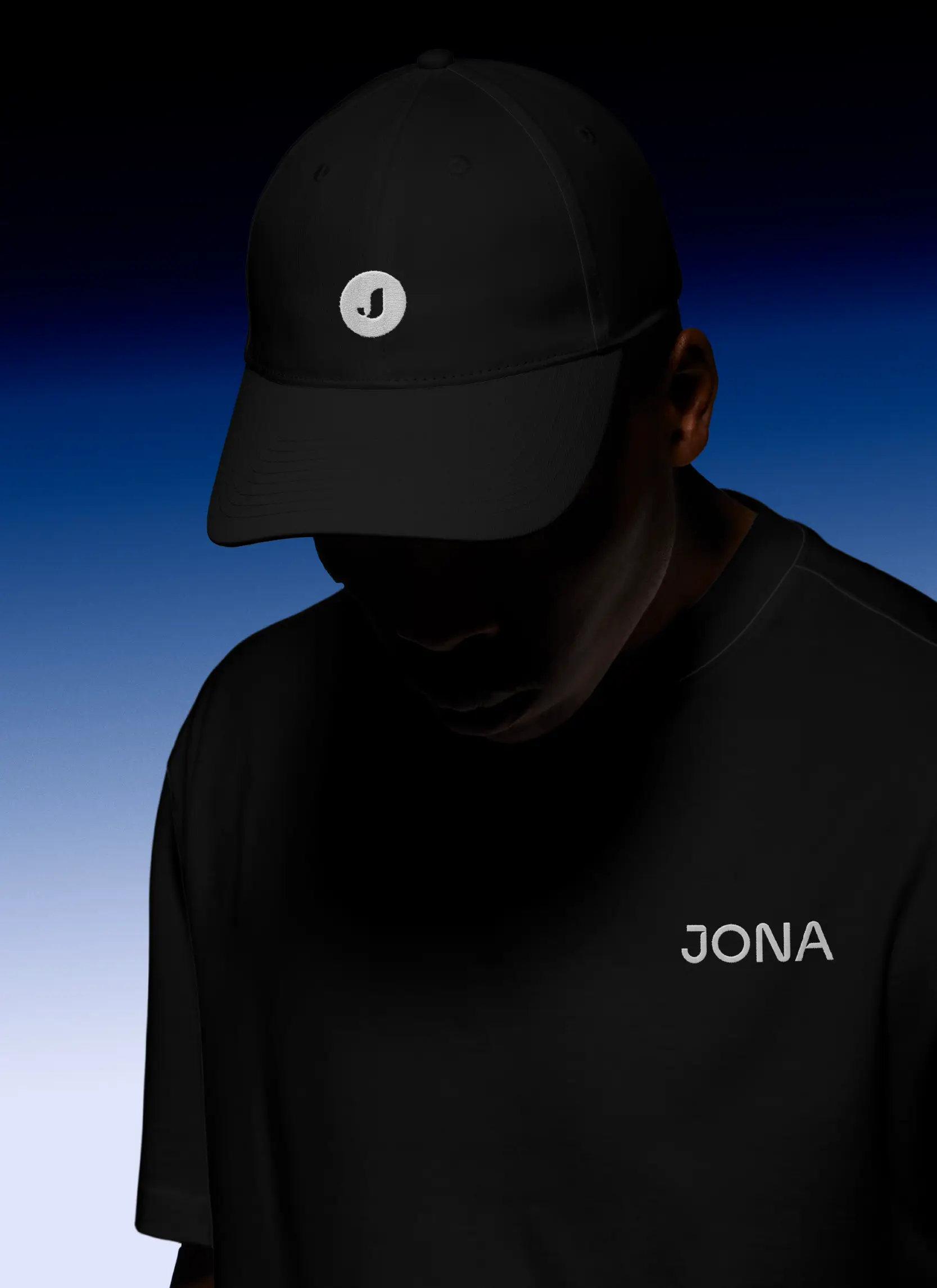
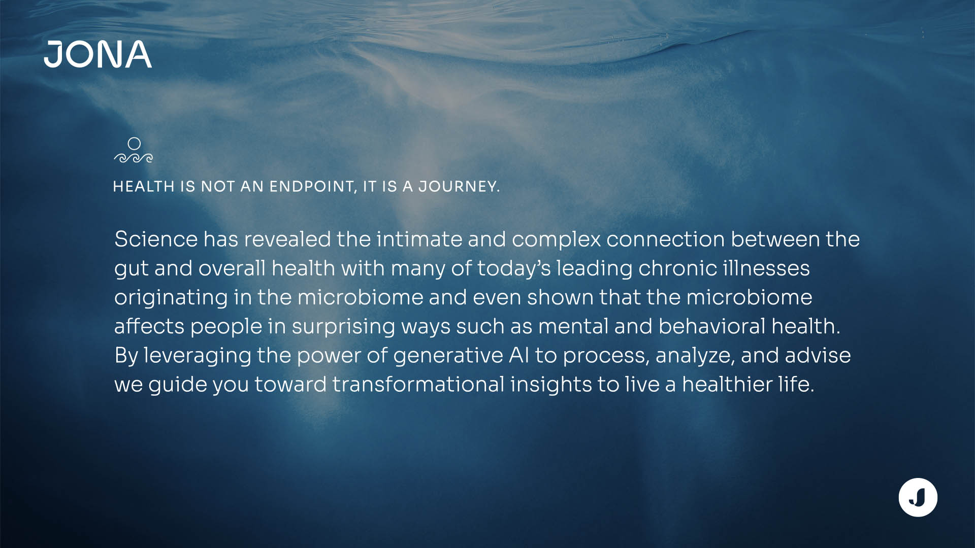
Delivering AI-powered gut microbiome analysis, helping transform symptoms into better health.
Context & Role
Jona is a New York–based health-tech company using AI to decode the gut microbiome, translating complex bacterial data into actionable insights for personalized health. Partnering from day one with the CEO, a Brand Strategist & the team, I shaped the brand system, digital & print assets to align science, clarity, and emotion. Today, Jona has delivered over 1.2 M insights, guiding a new era of personalized health with gut microbiome's science combined to AI.
Client location / USA
Leo Grady CEO
Jillian Sue Head of Product
Sha Zhan Former Head of Product
Maclay Ramsay UX Designer
Audra Walker UI Designer
My Missions
Art direction concept, visual territories, photo direction
Brand system logo, type, colors, icons, layout
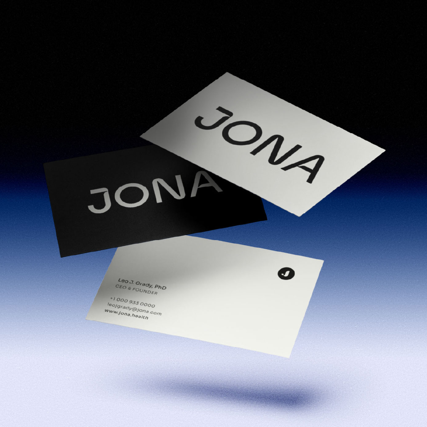
Print packaging, cards, flyers, branded clothing
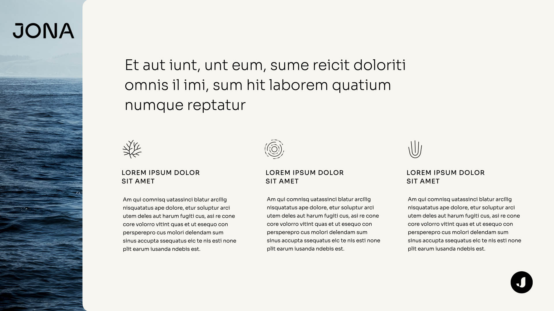
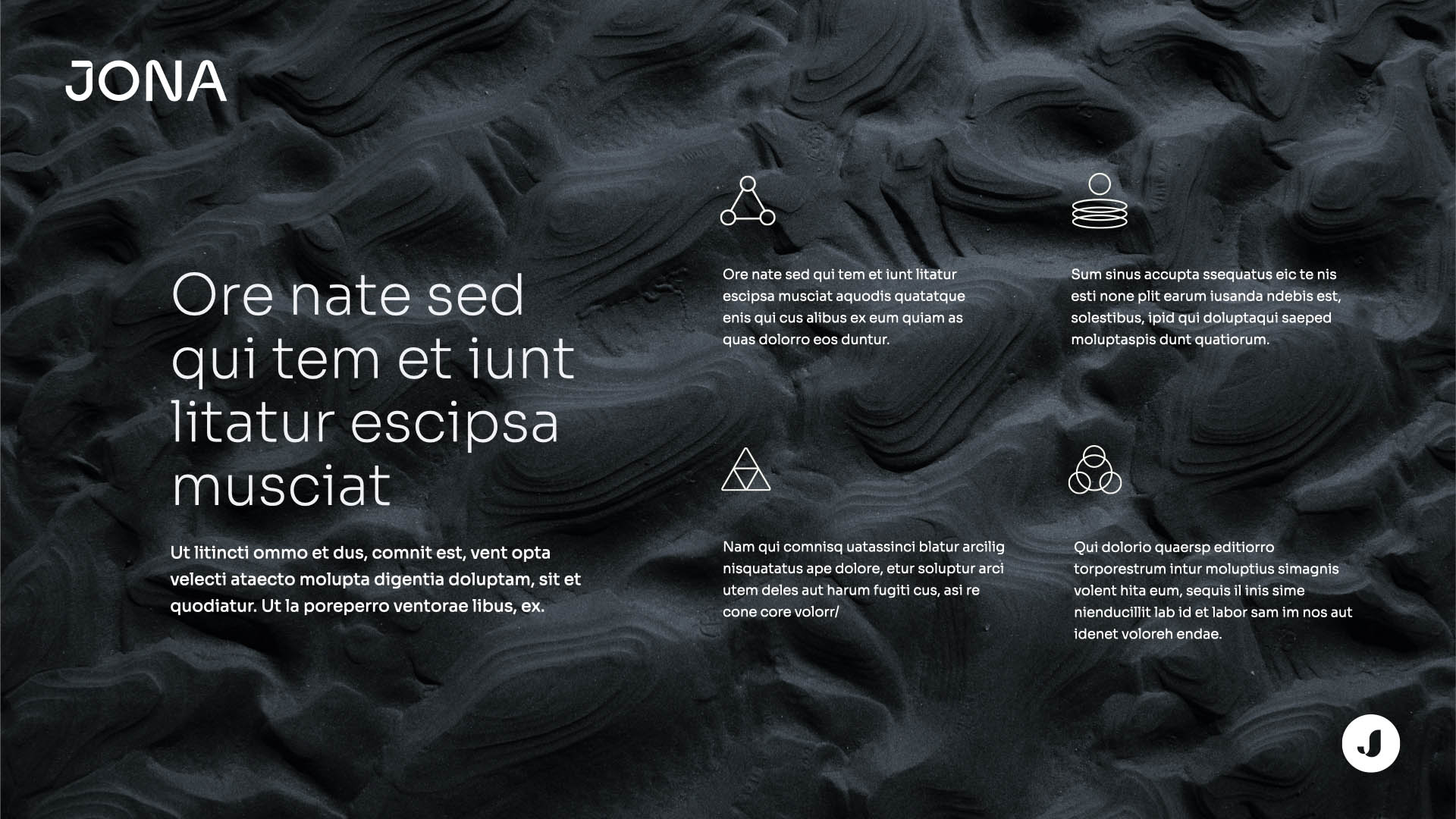
Digital website, product UI guidelines, Social Media Content static & motion
Brandbook brand system documentation
Partners
Brand Strategist Lexi Kafkis
Images AdobeStock & Firefly
Software UX UI in-house product team
WebSite Developers Wawww studio
Packaging Manufacture Cosmosid Manoj Dadlani
Clothing SwagUp
Print Moo.com
Concept
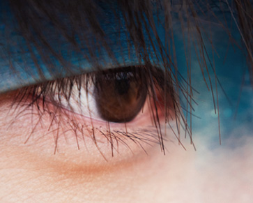
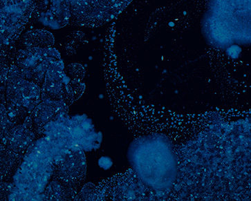
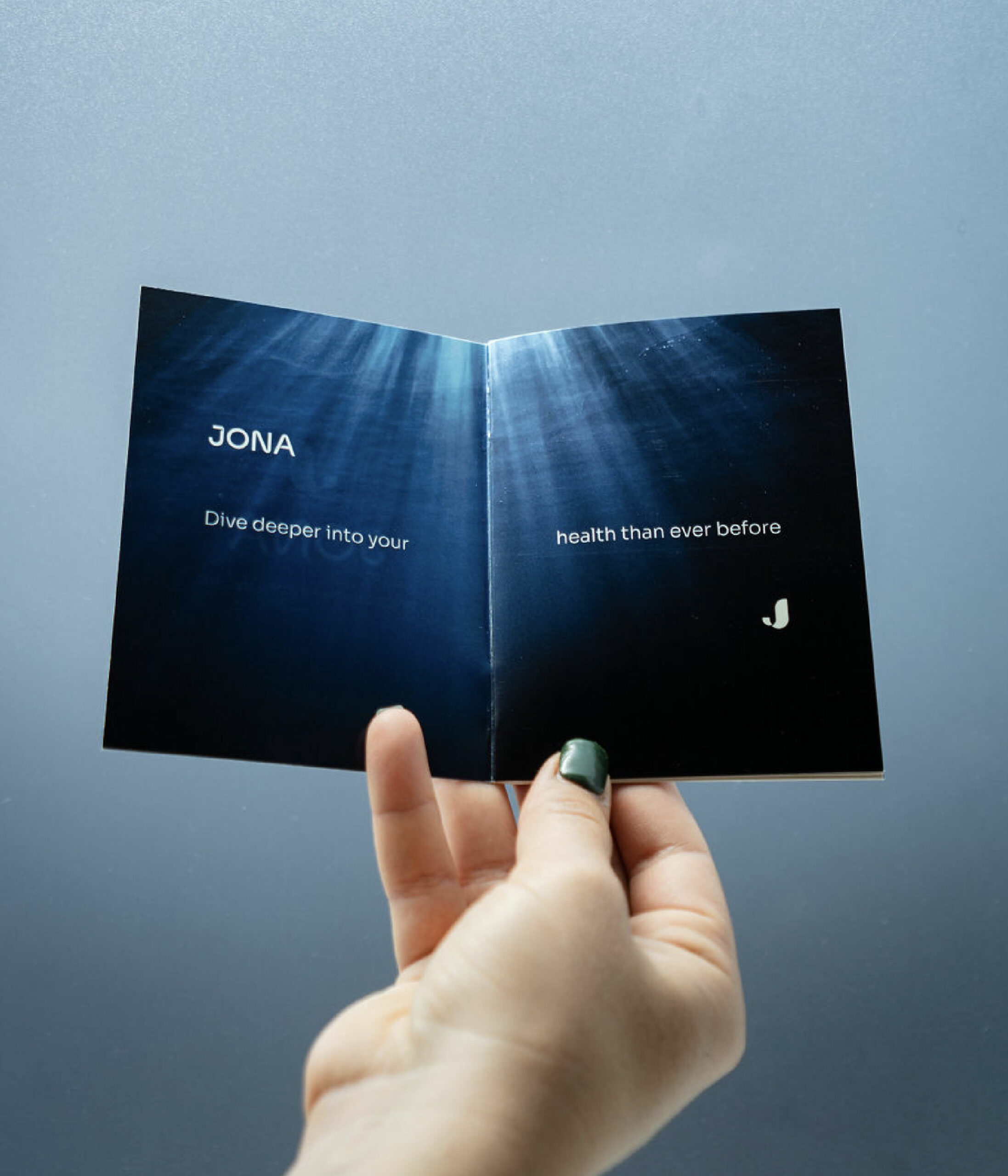
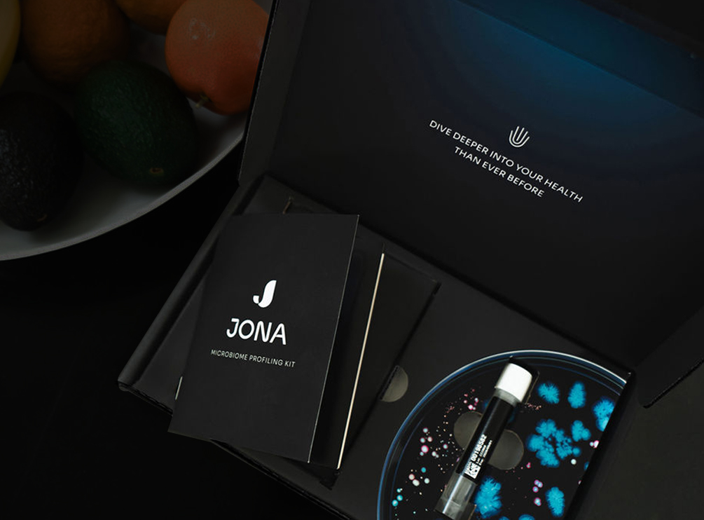
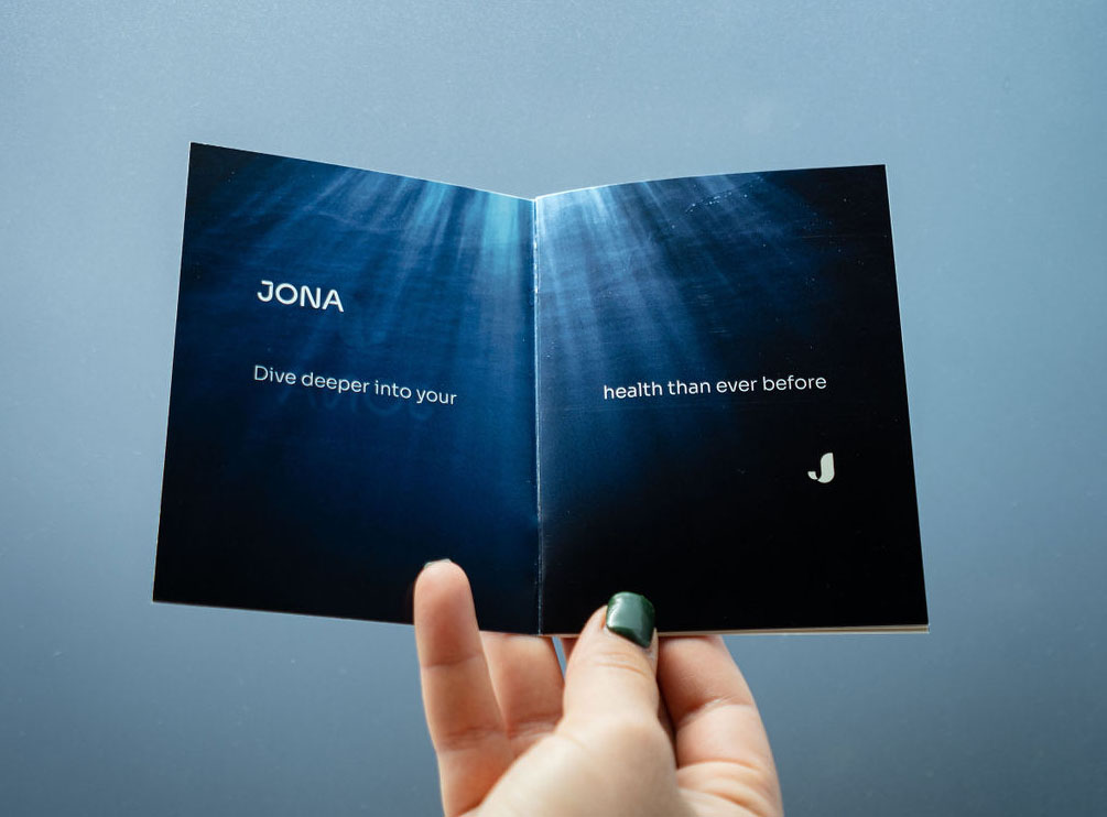
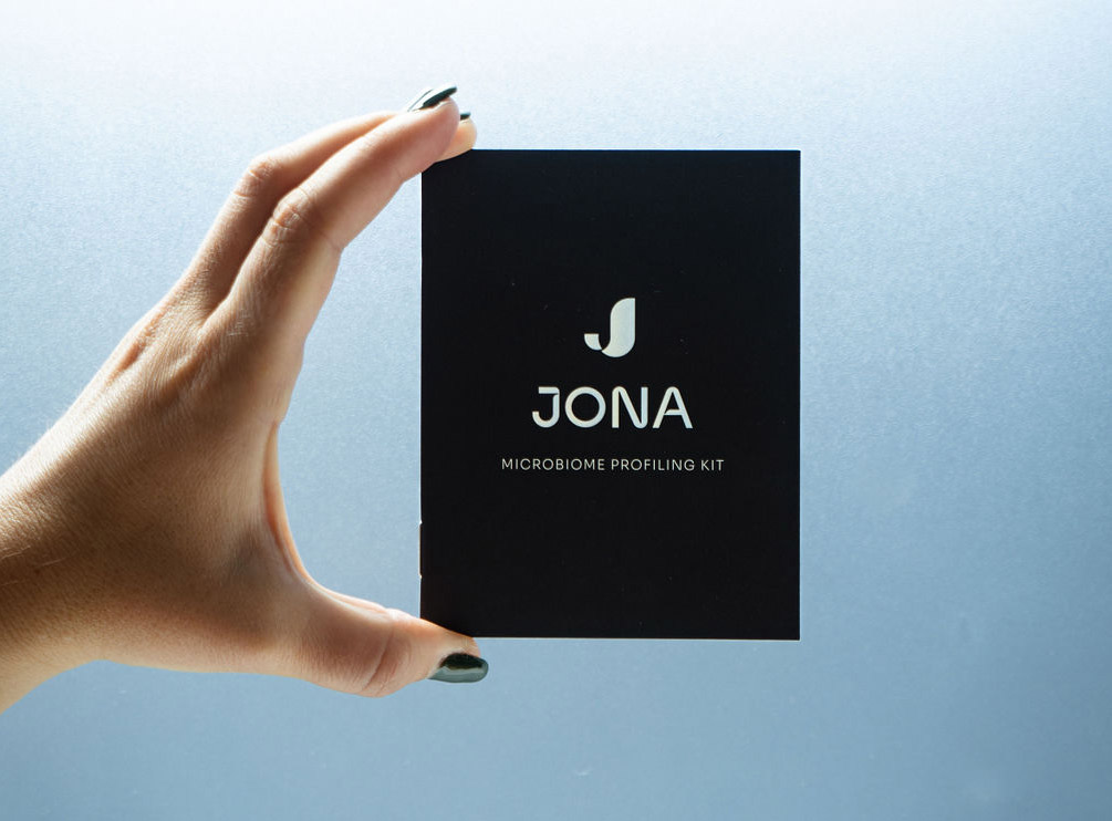
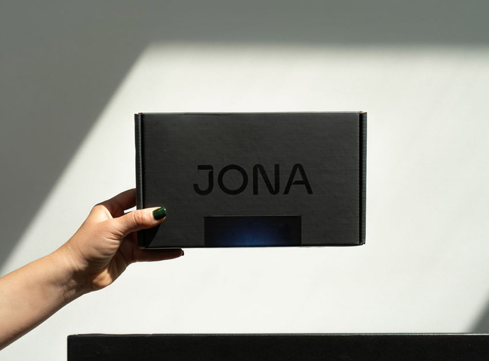
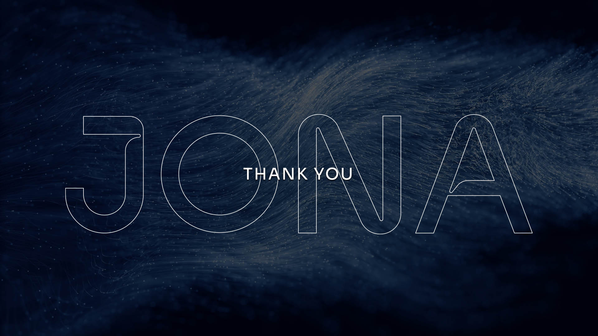
Jona’s identity embraces the spirit of exploration, an odyssey into the hidden world of the gut microbiome enabled by advanced technology. Inspired by NASA’s iconic logotype, it evokes discovery across vast, uncharted frontiers. The palette blends ocean depths with subtle skin tones, while organic textures and symbolic icons echo humanity’s early attempts to map the unknown. The result is a sober yet powerful identity rooted in myths of transformation and discovery.


Logotype
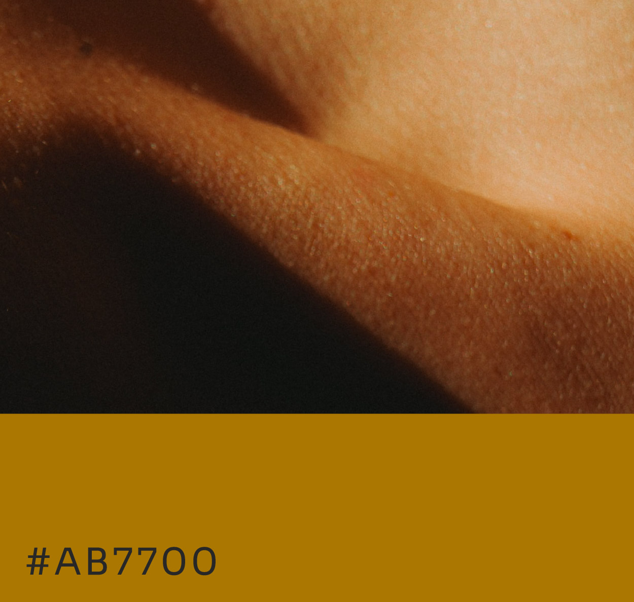
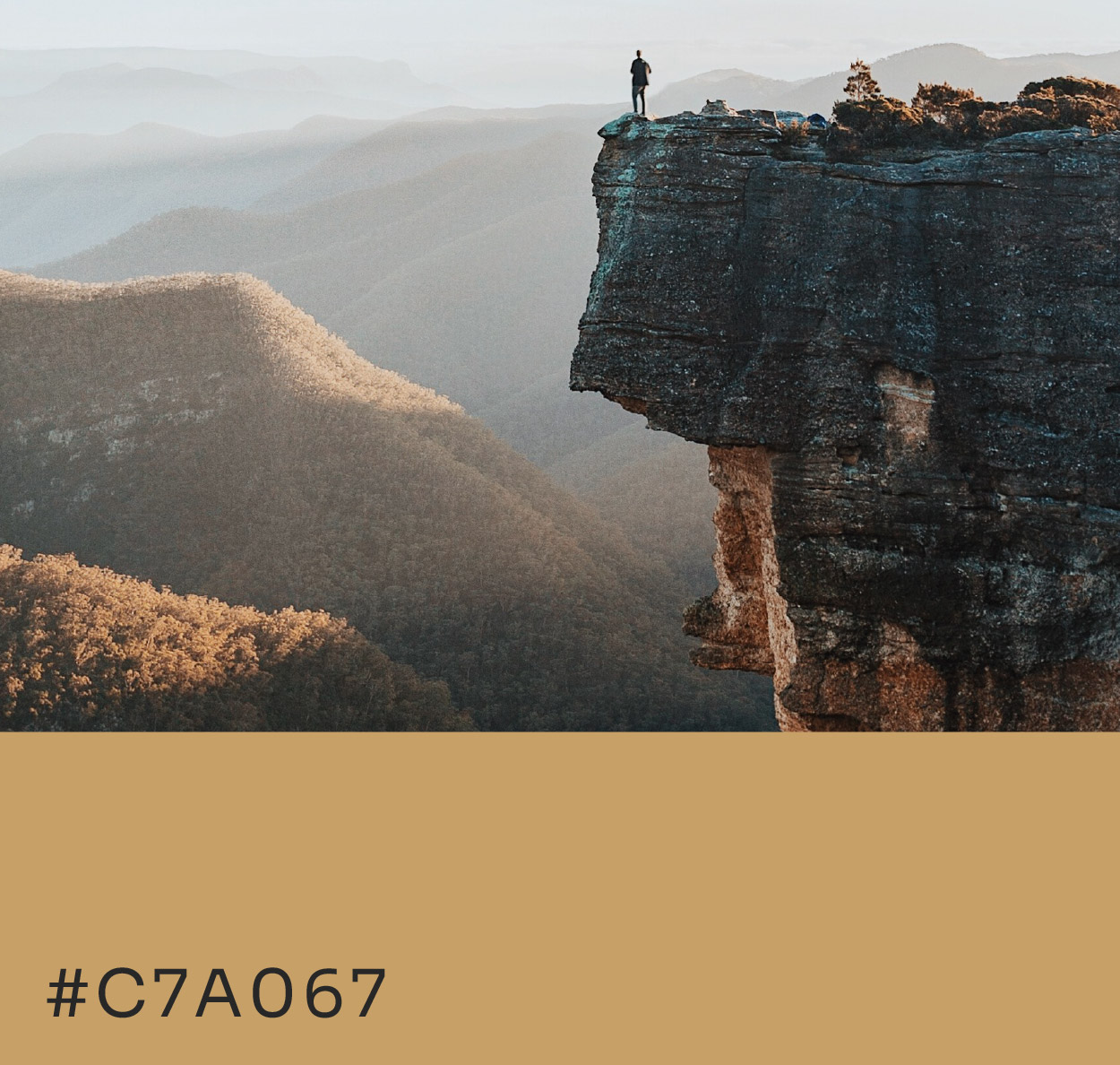
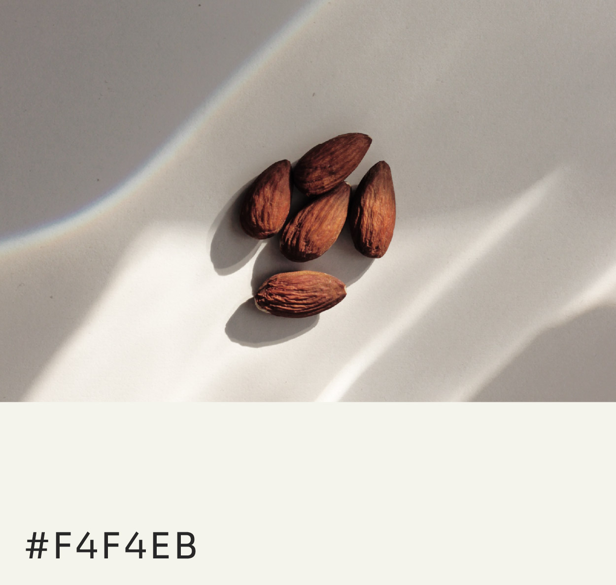
Colors
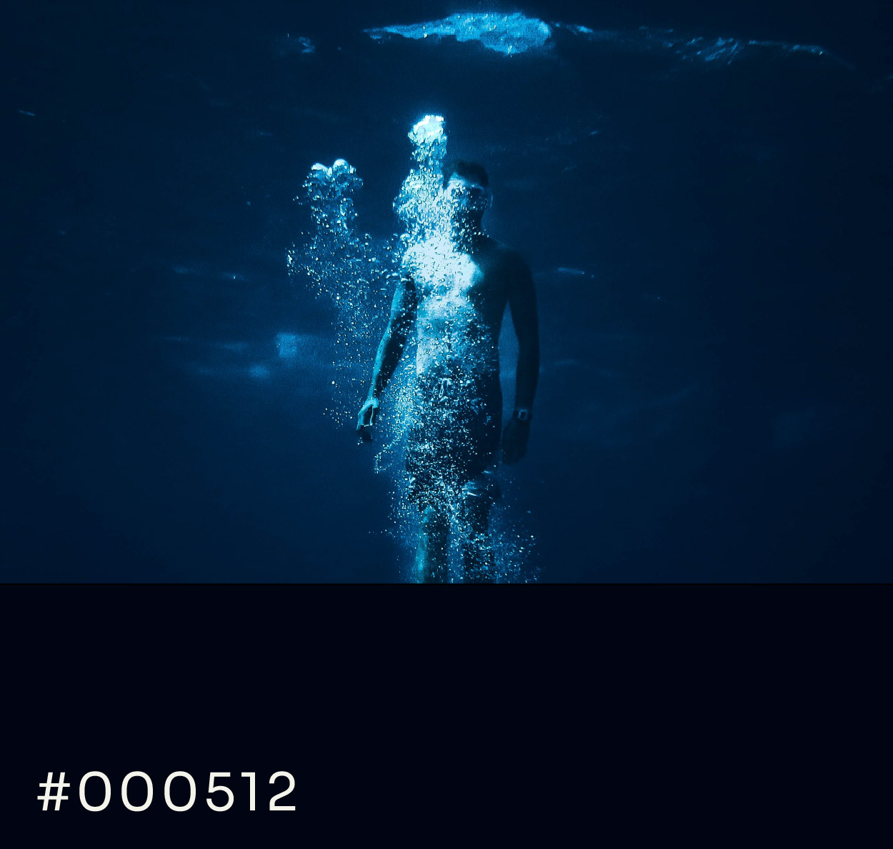

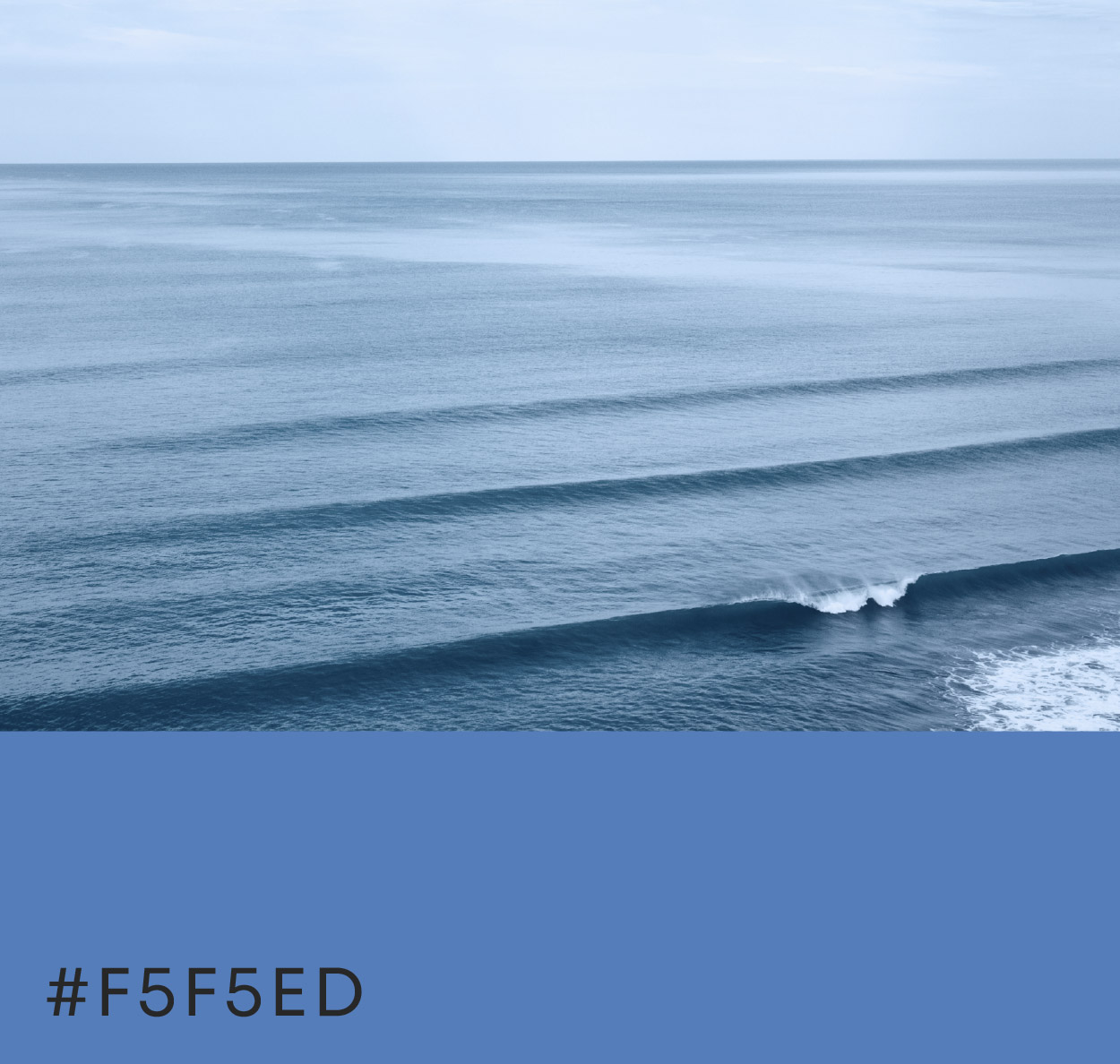
Visual Universe

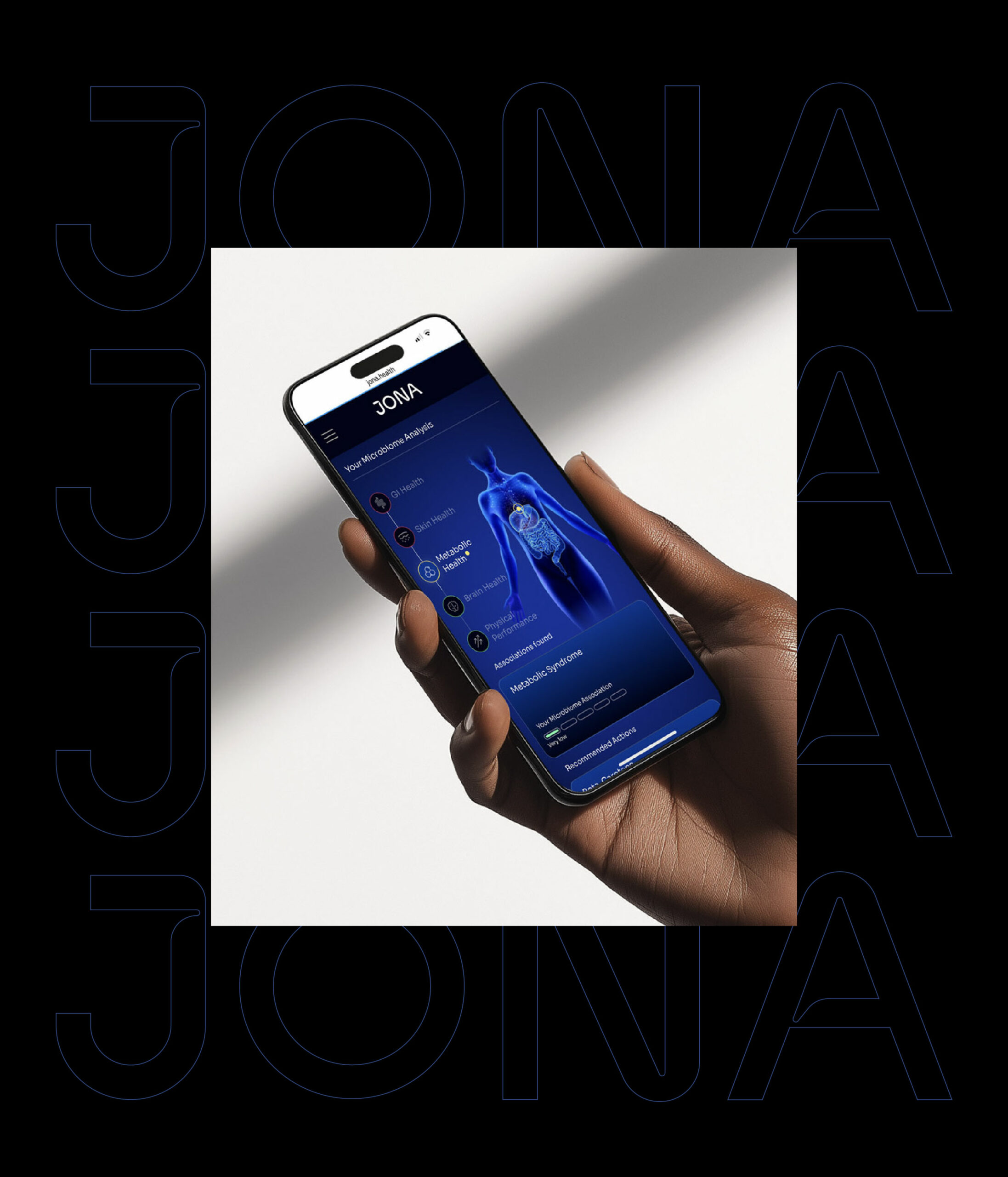


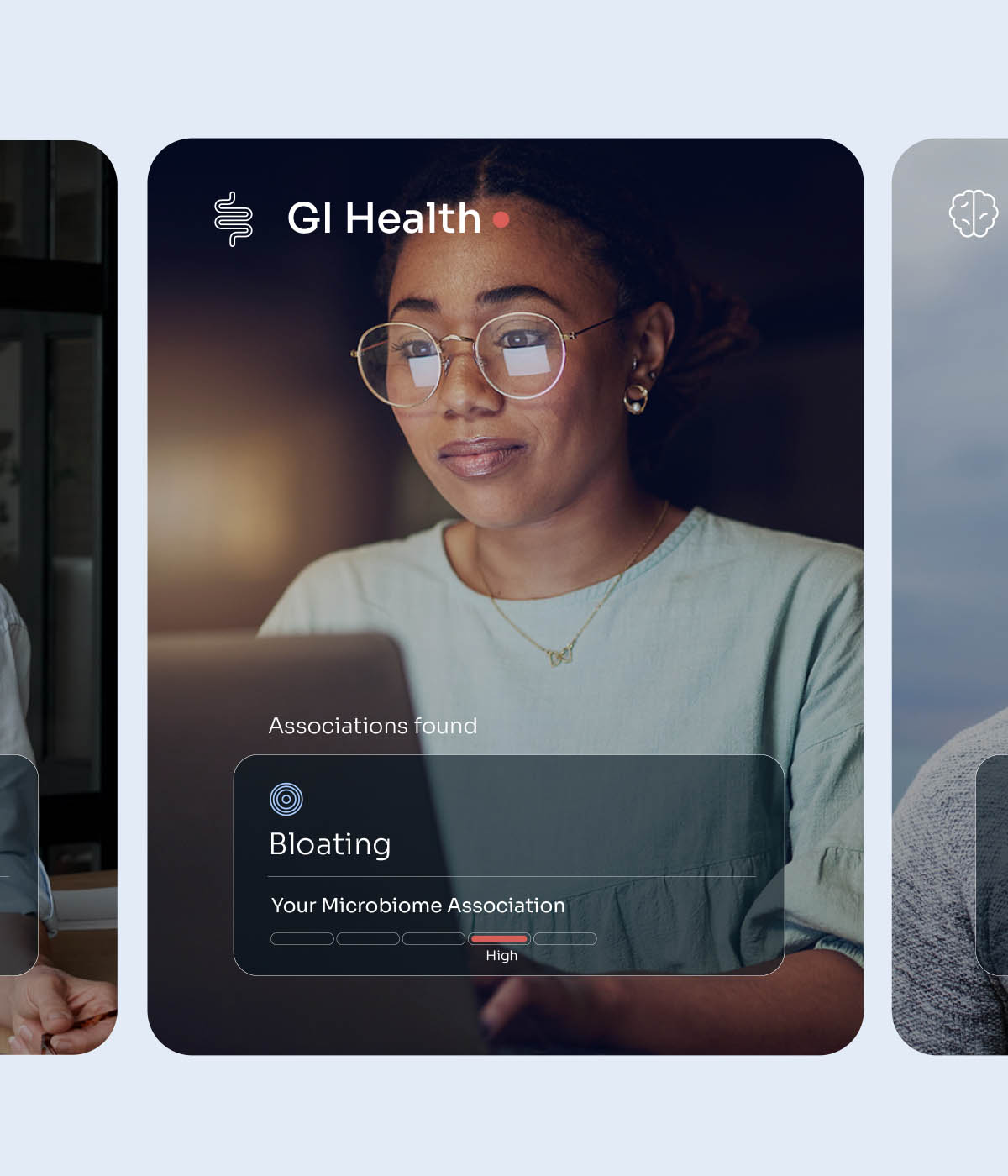
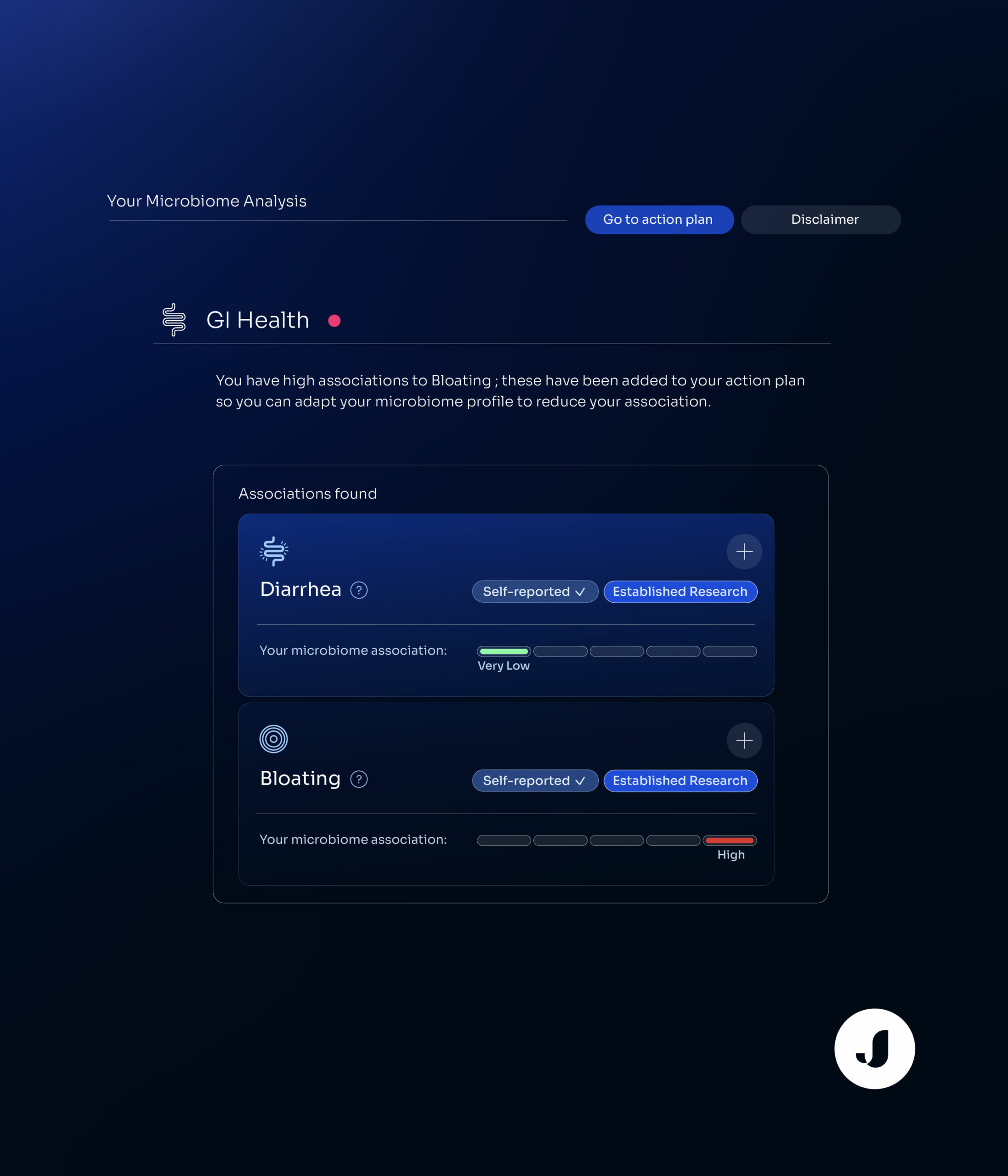
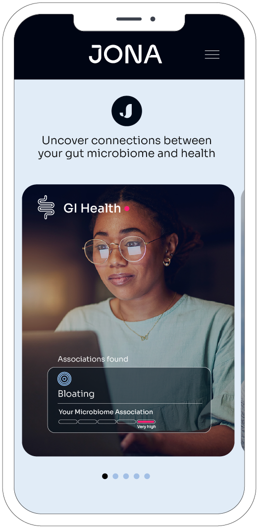
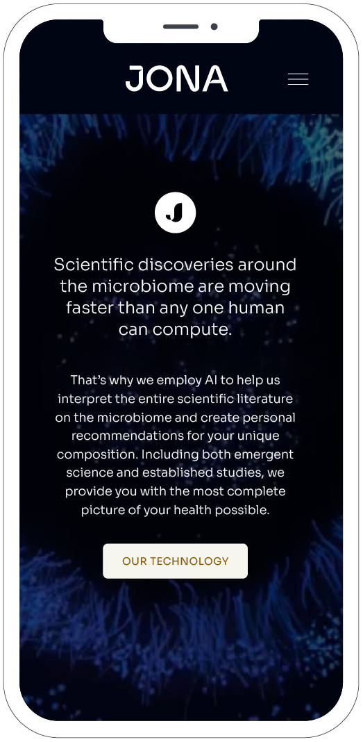
Website

Typography
SORA
LOWERCASE & UPPERCASE
Aa Bb Cc Dd Ee Ff Gg Hh Ii
Jj Kk Ll Mm Nn Oo Pp Qq Rr
Ss Tt Uu Vv Ww Xx Yy Zz
NUMBERS
0123456789


Icons


Packaging
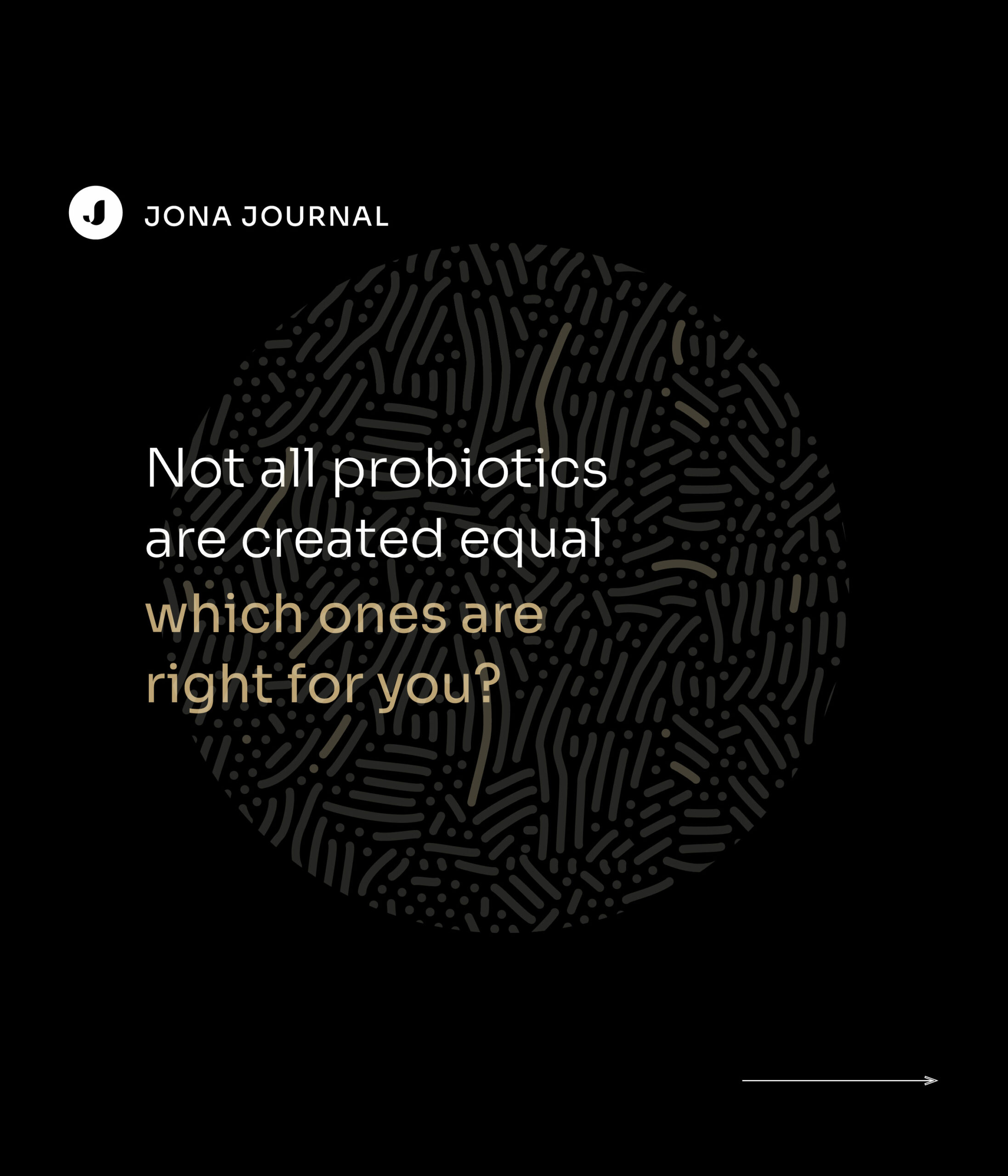
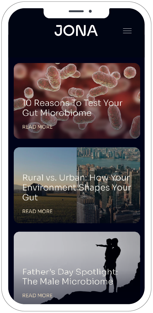
Digital content

Keynote
Brand Video
Providers brochure

Brandbook

Client's Reviews
"Clara is one of the most talented designers I’ve ever worked with."
"Her impeccable taste and attention to detail come together in work that’s not only visually stunning but conceptually sharp. She understands design as both an art and a strategy, creating beautiful work that’s also deeply thoughtful and effective."

Alexis Kafkis
Strategist & Head of Brand / JONA

Projects


Contact
clara lei studio
Working from Normandy, France
Mail → claralei@claraleistudio.com