Project scope
/ART DIRECTION
/BRAND SYSTEM
/PITCH DECK
/DIGITAL CONTENT
/UI DESIGN
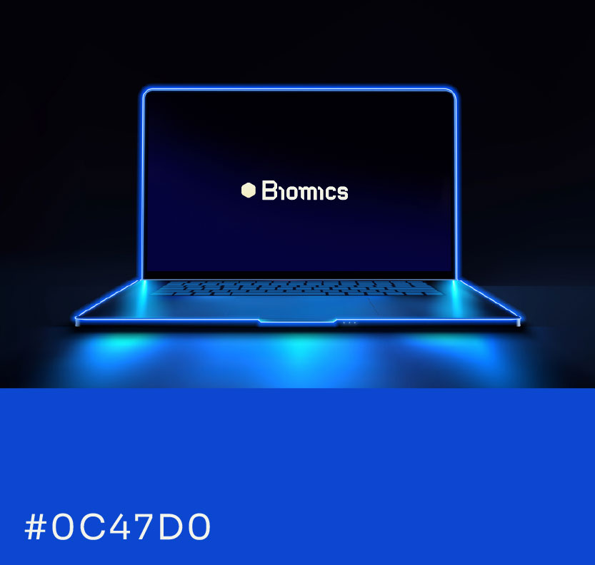
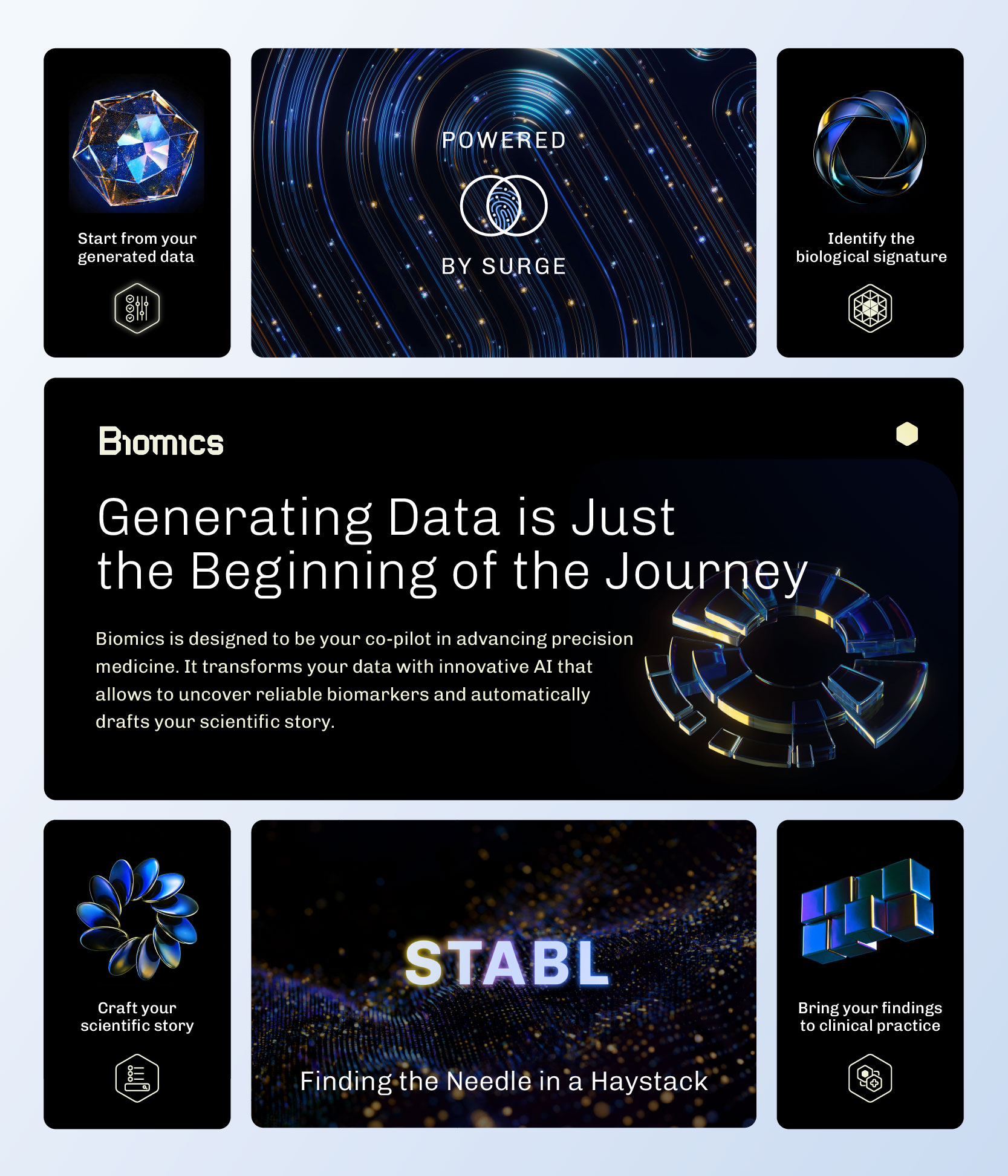
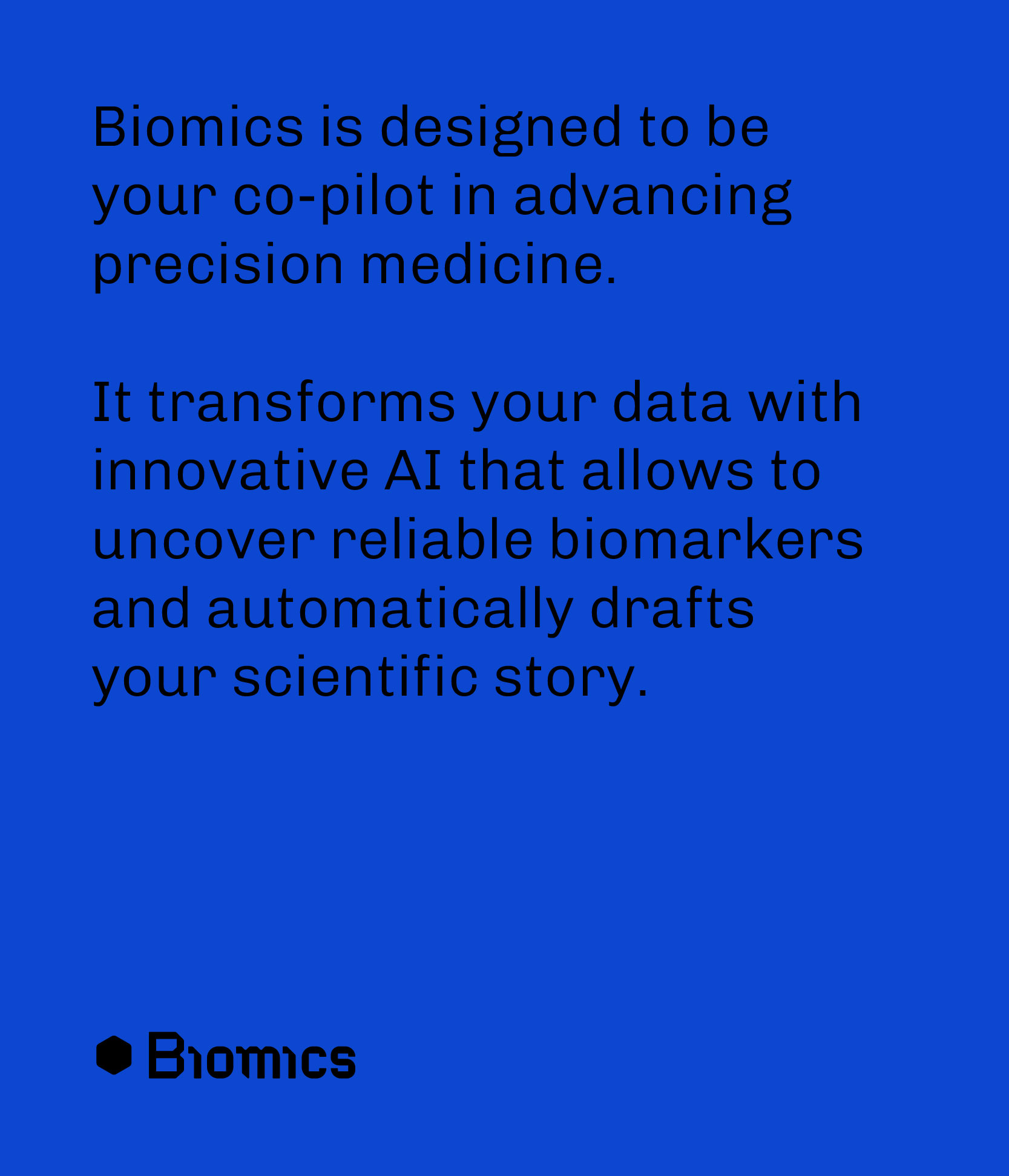
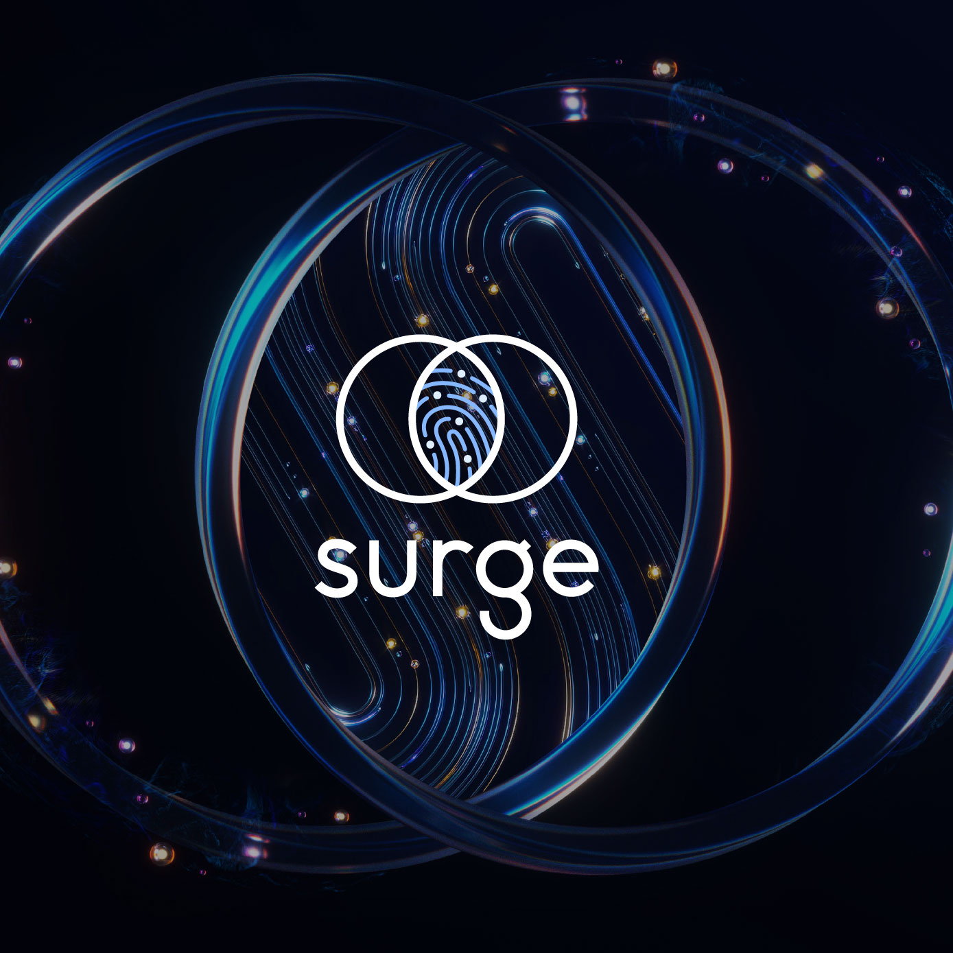
Advanced AI platform unlocking new dimensions in biomarker research and discovery.

Context & Role
Following the success of Surge’s identity, I designed Biomics as its natural continuation: an AI platform turning complex omics data into actionable biomarker discovery. The collaboration culminated with a Nature Biotechnology cover in 2024.
Client location France & USA
Valentin Picot SURGE CMO
Grégoire Bellan BIOMICS Head of Data Science
My Missions
Art direction concept, narrative, visual territory, photo direction, motion supervision
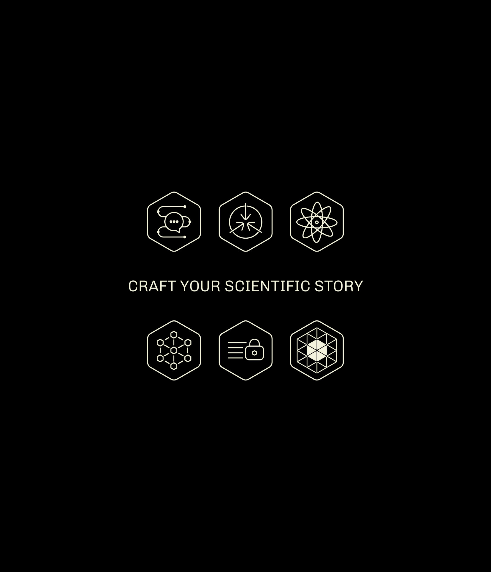
Brand system logo, type, color, icons, layout
Pitch Deck designing impactful investor decks
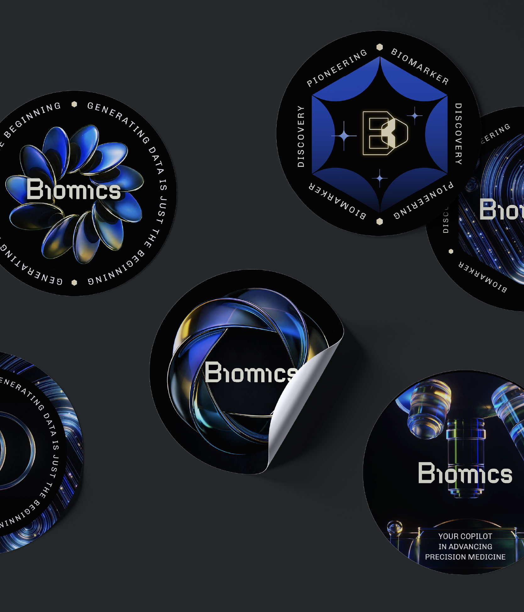
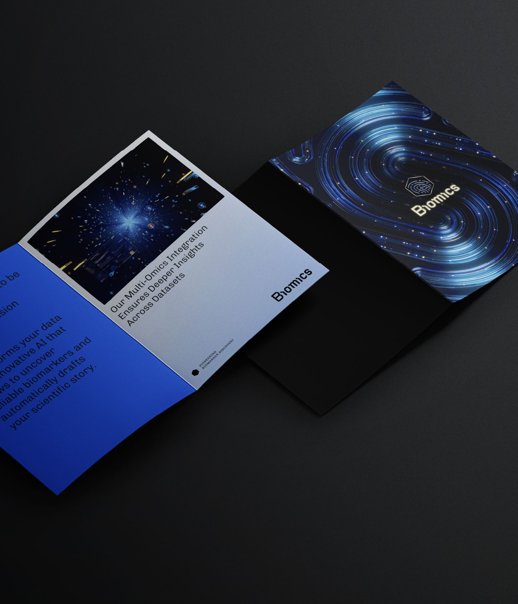
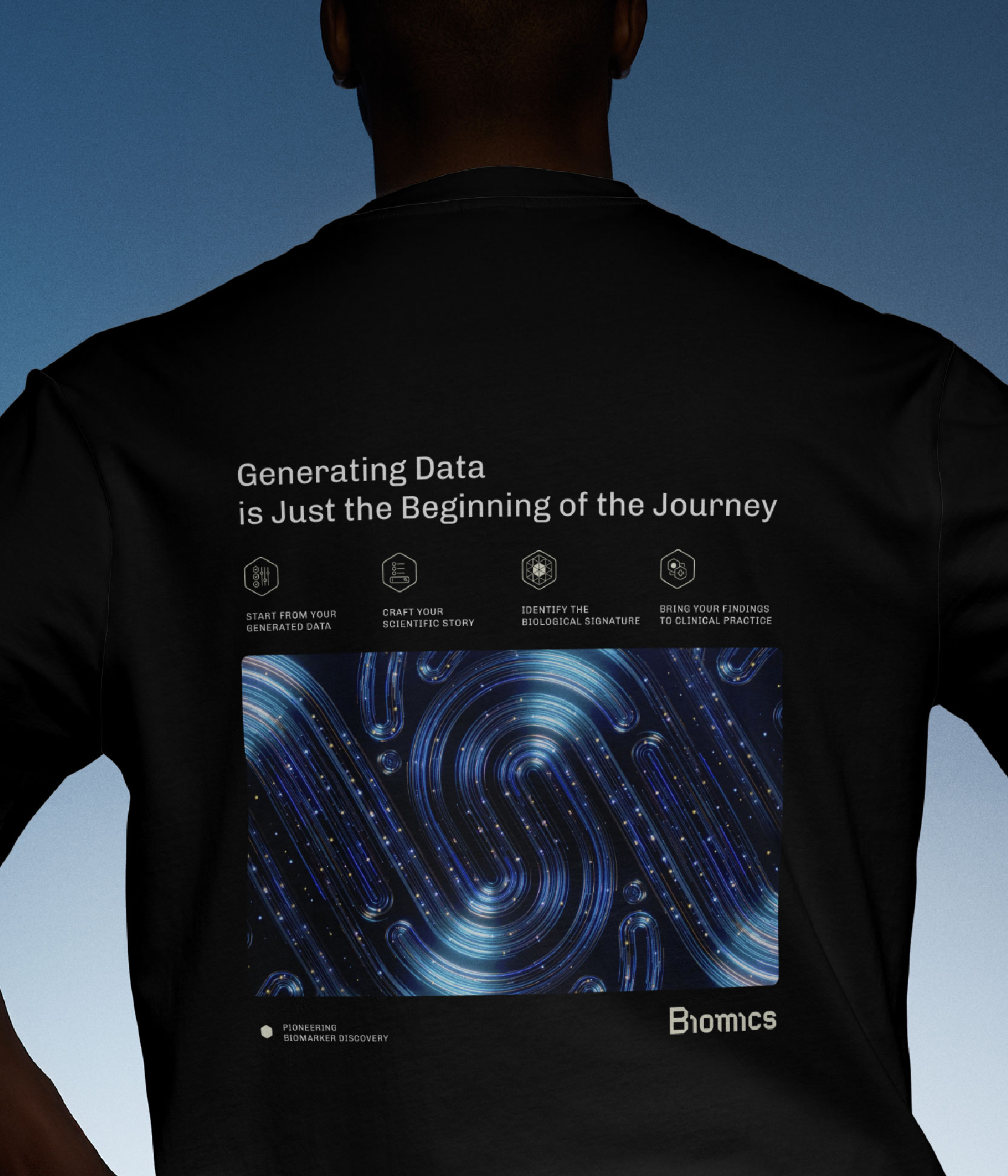
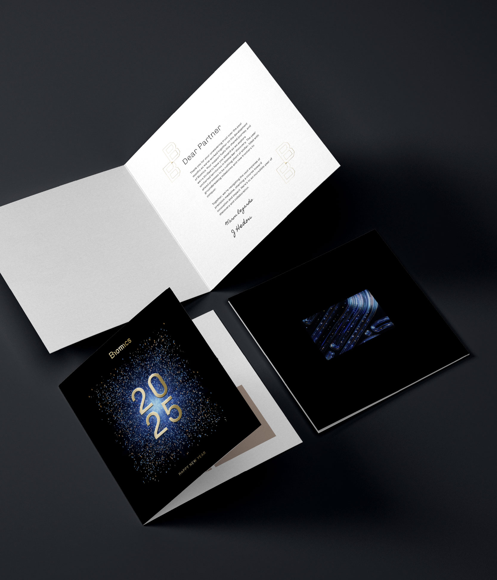
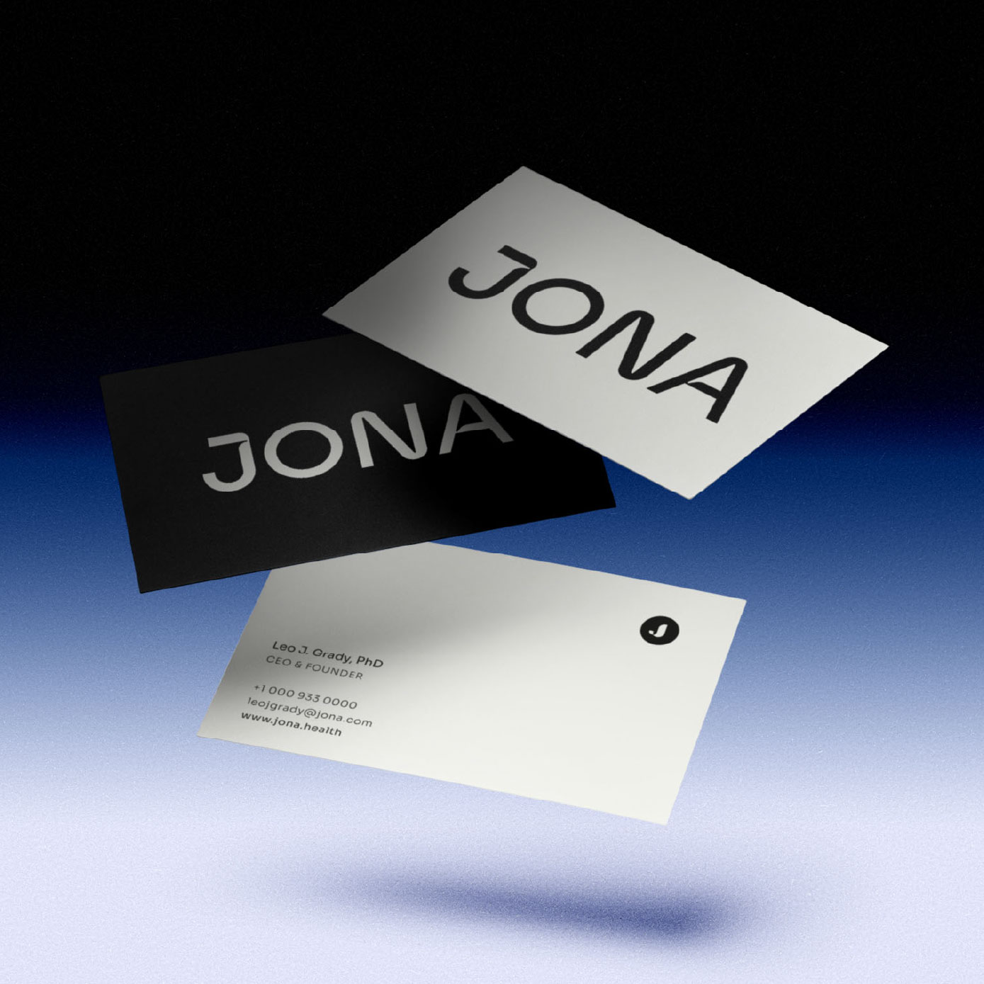
Print cards, flyers, apparel...
Digital UI product guidelines & website design
Brandbook interactive, scalable documentation
Partners
Film & 3D (images extracts) Doze Studio
Images AdobeStock & Firefly
Developers Wawww studio
Clothing Main Gauche
Print Moo.com
Concept
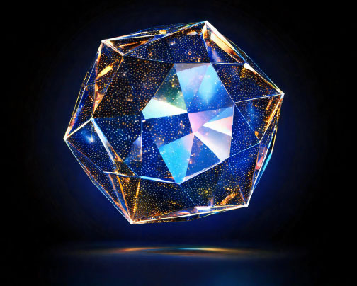
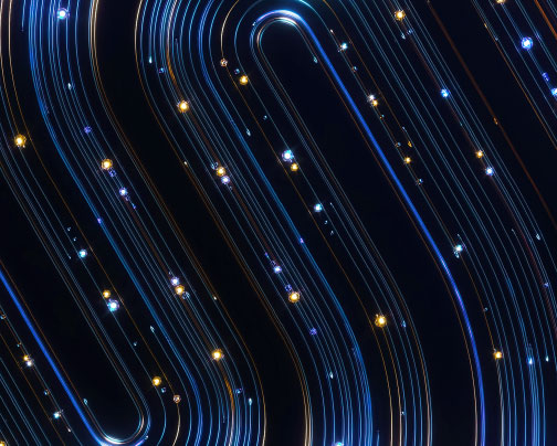
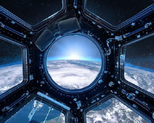
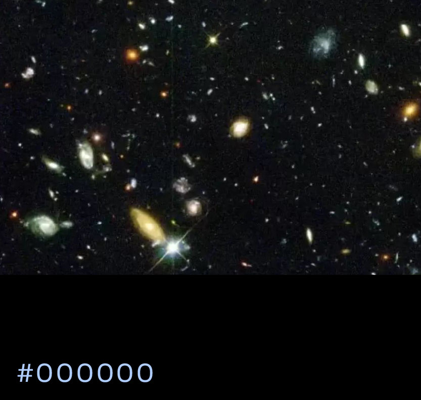
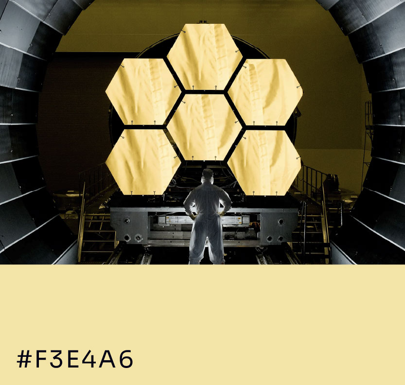
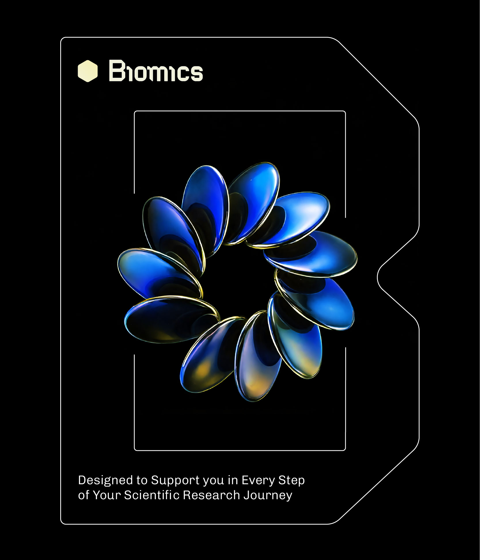
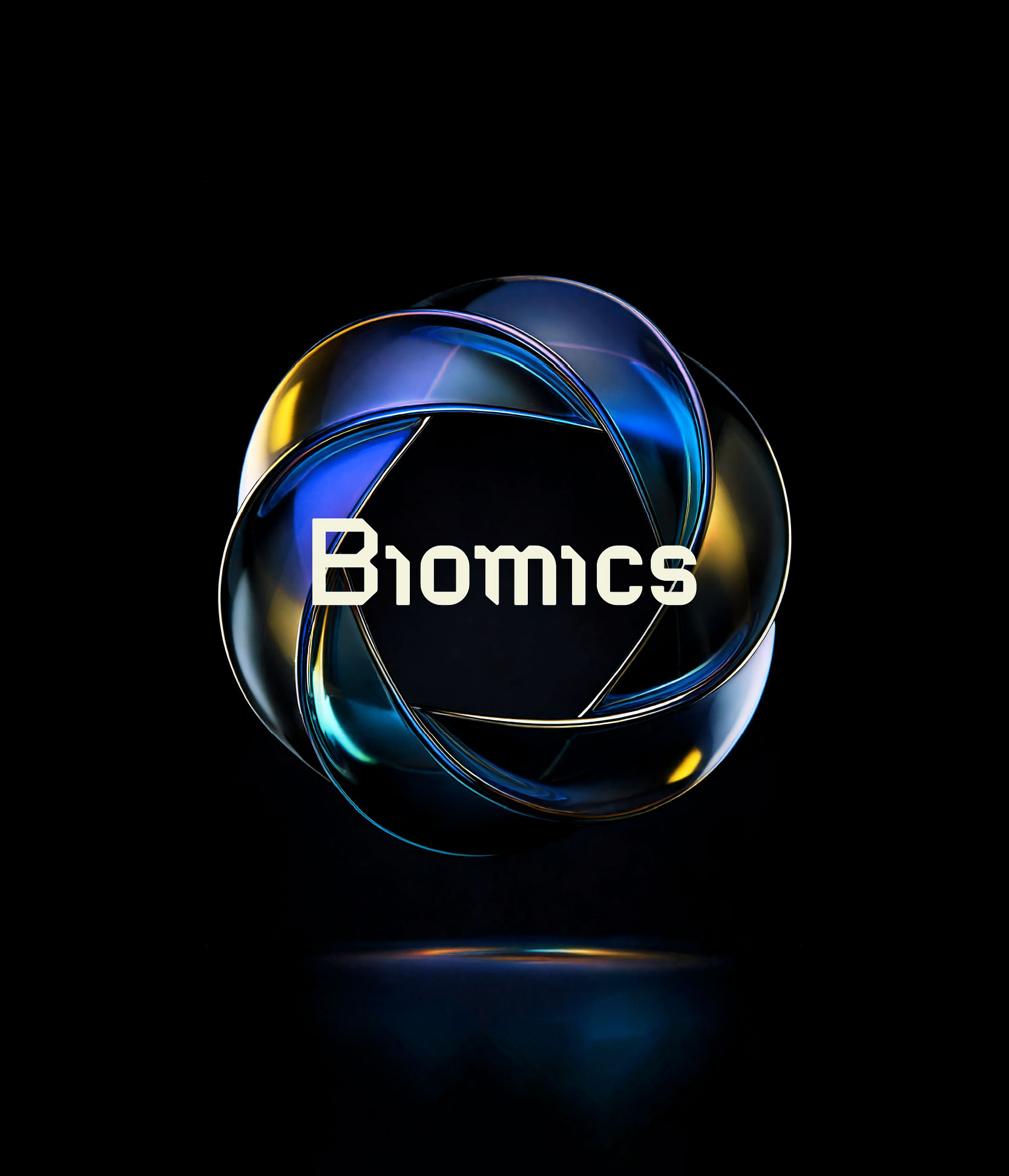
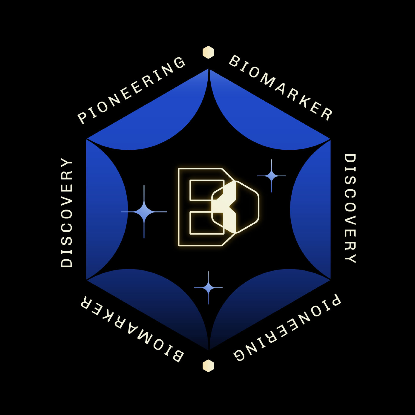
Biomics is the operational core of Surge’s vision — where data becomes discovery. Inspired by the James Webb Telescope, its hexagonal architecture and metallic textures evoke the machinery of exploration and the precision of AI. Designed as a tool for scientists, Biomics turns massive biological data into structure and understanding. It translates Surge’s cosmic language into performance — carrying its vision forward through a platform built for precision and discovery.
Logotype
Designing Identity Through Geometric Space Engineering
The logotype echoes the engineered geometry of space exploration, with angular cuts and hexagonal cues recalling modules and airlock doors. This design balances technical rigor with symbolic depth, evoking a gateway to discovery. Its proportions ensure a striking presence at large scale while remaining clear and recognizable in the smallest formats.
Colors
Layout

Typography


Website
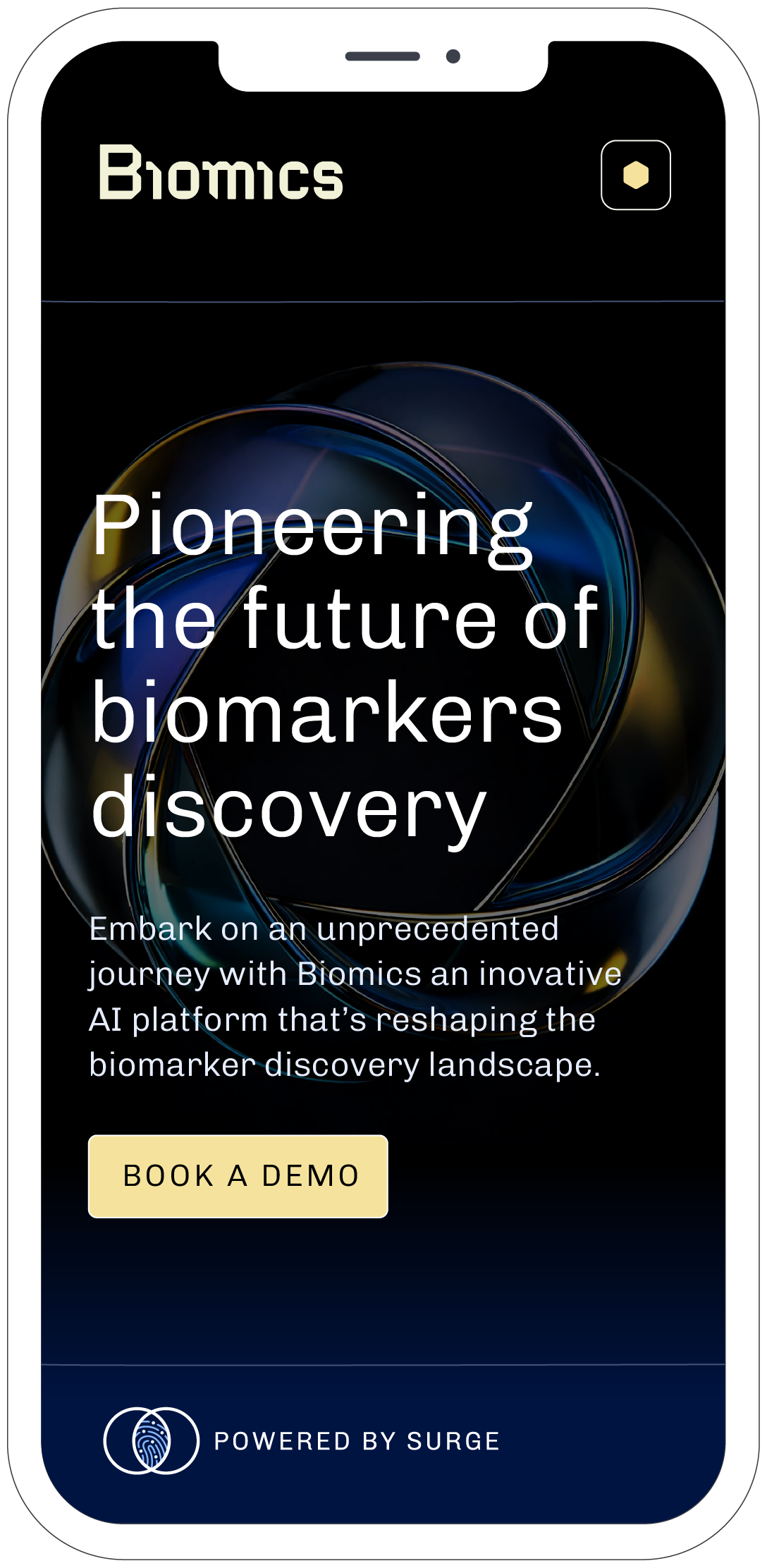
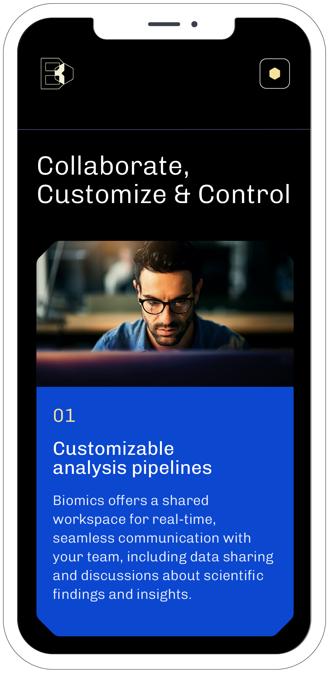
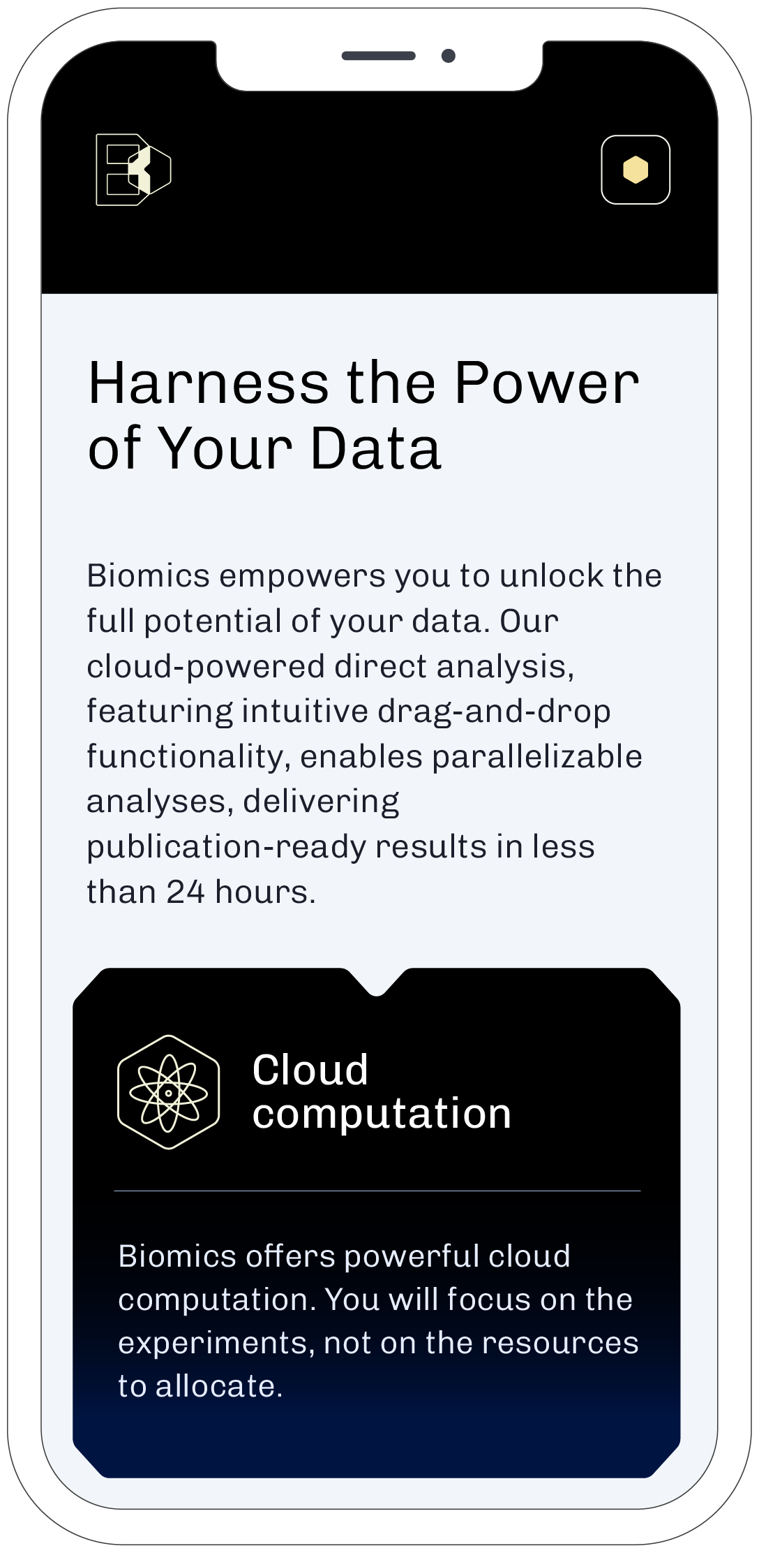
Software
(UX/UI design: WAWWW Studio)


Visual Identity in Print
Brandbook

Projects


Contact
clara lei studio
Working from Normandy, France
Mail → claralei@claraleistudio.com