Project scope
/ART DIRECTION
/ILLUSTRATION
/BRAND SYSTEM
/DIGITAL CONTENT
/UI DESIGN
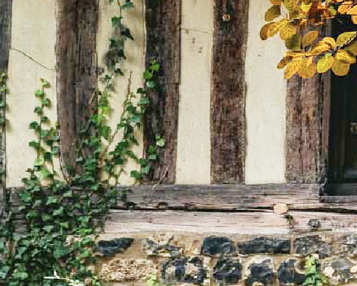
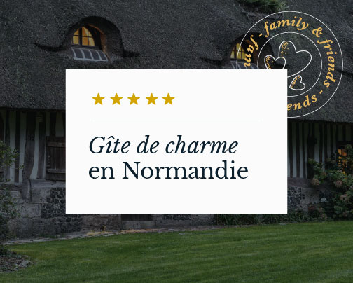
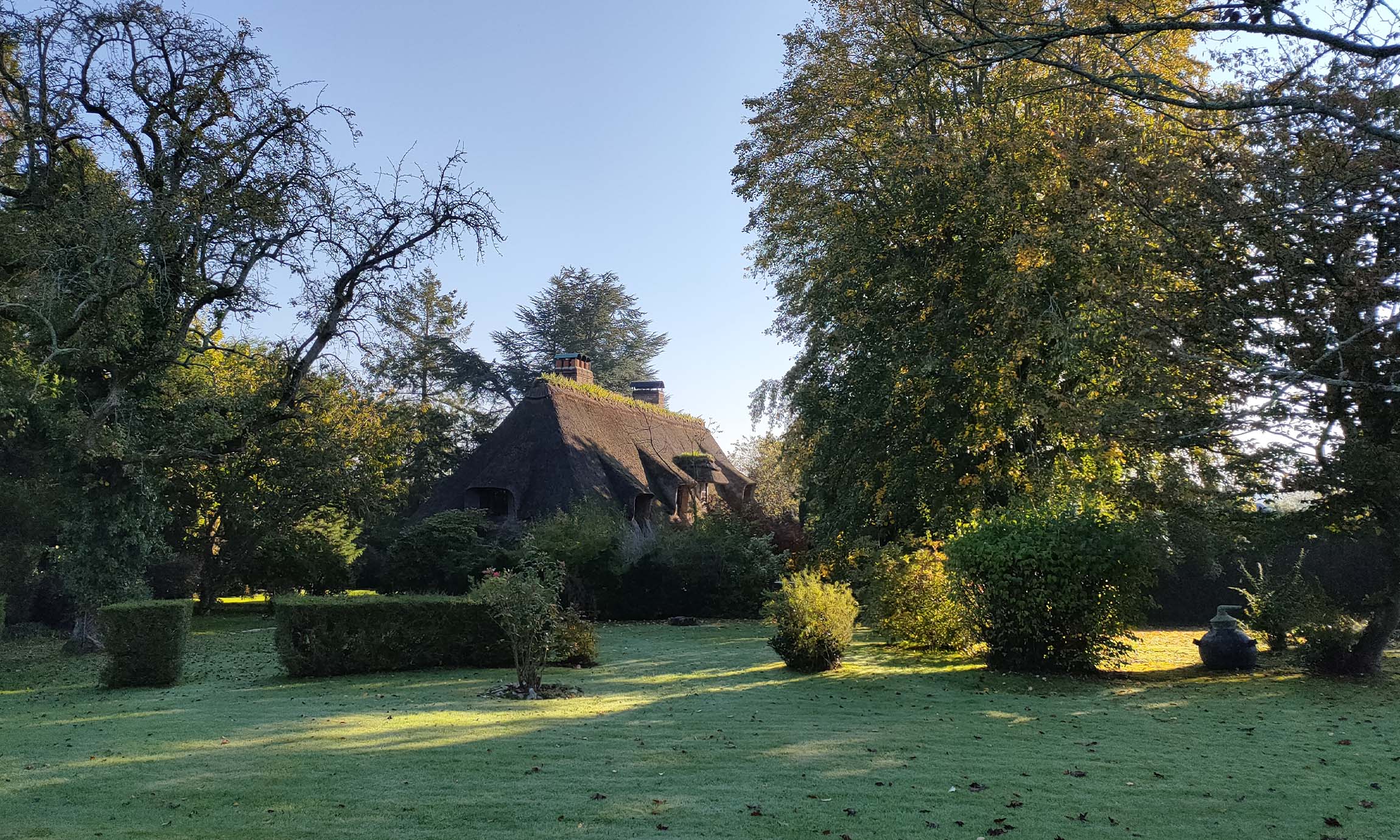
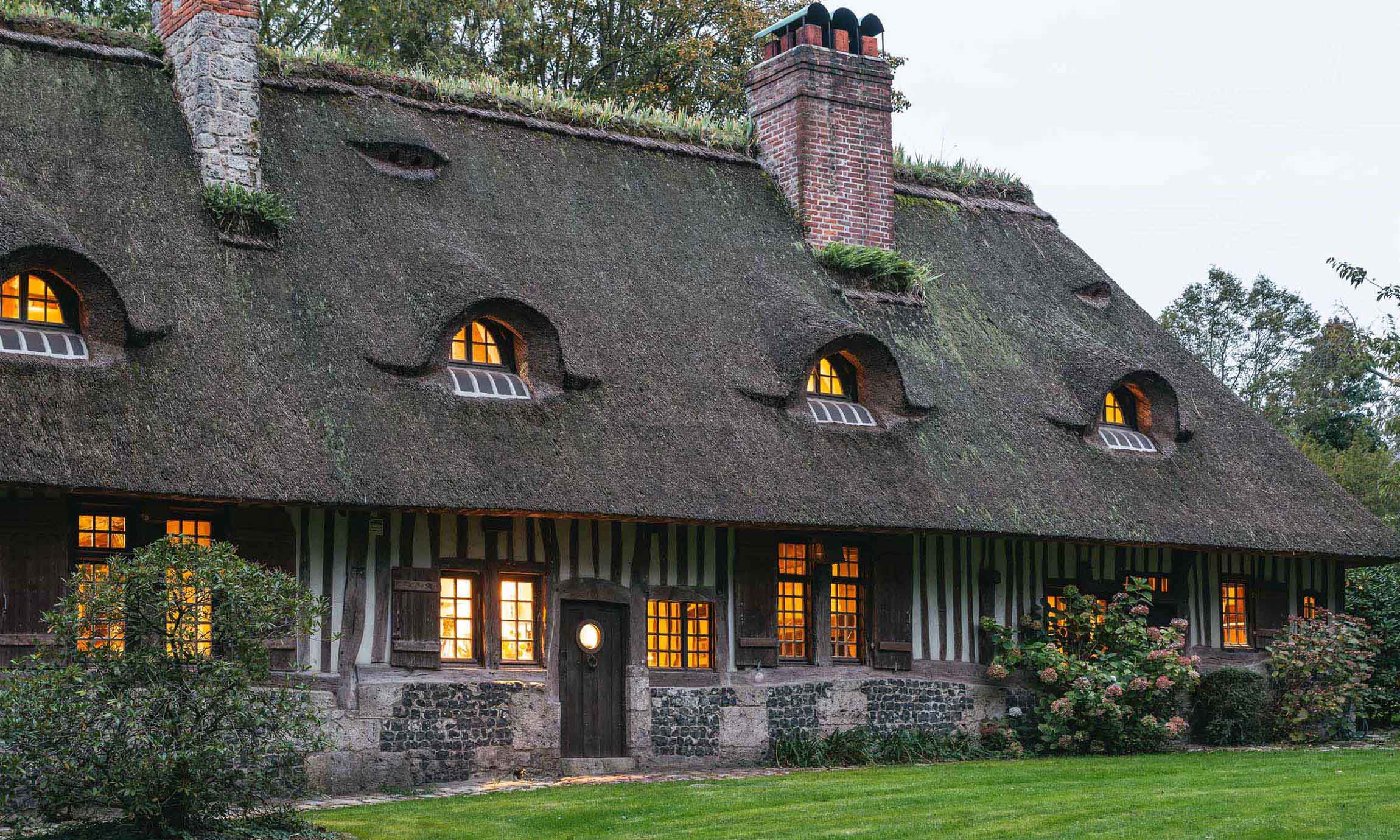
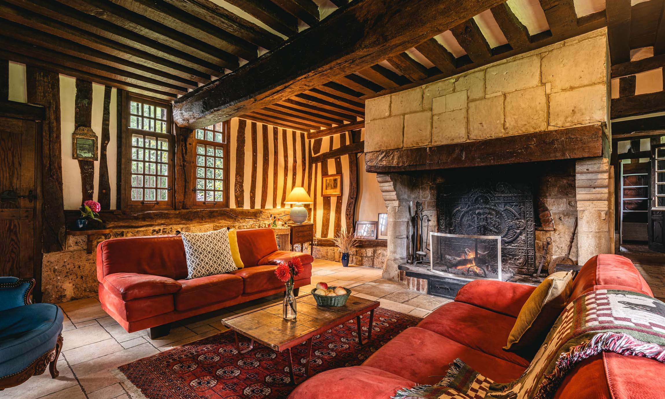
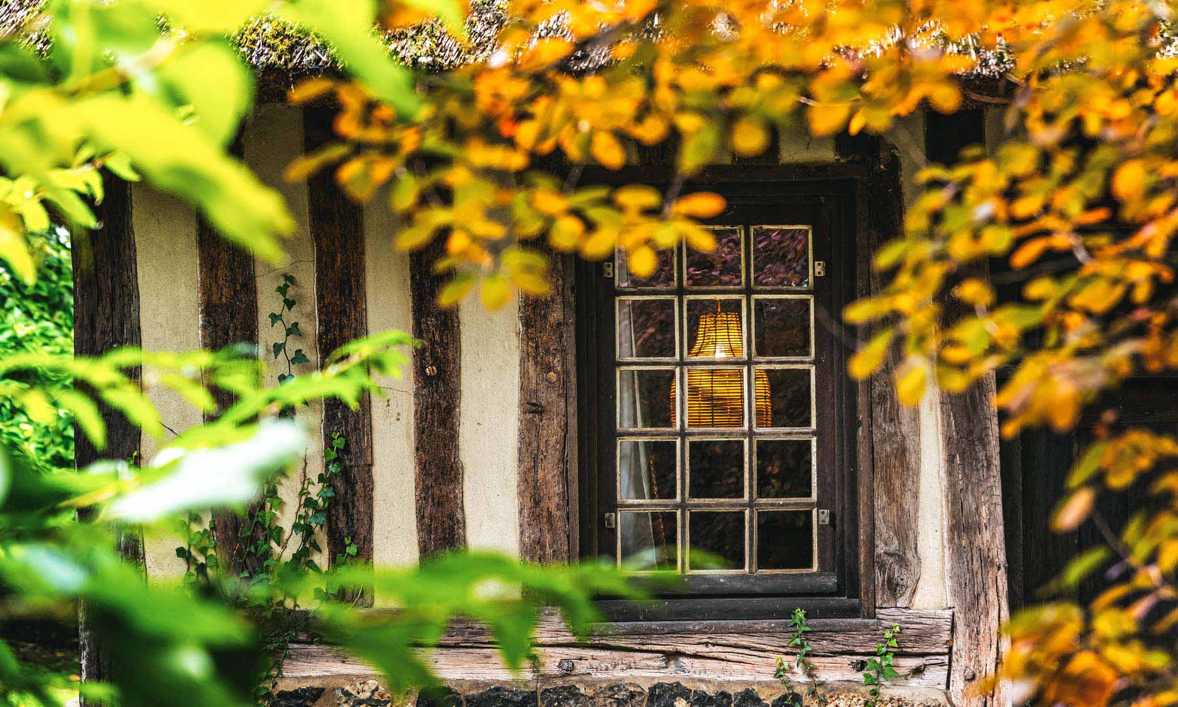
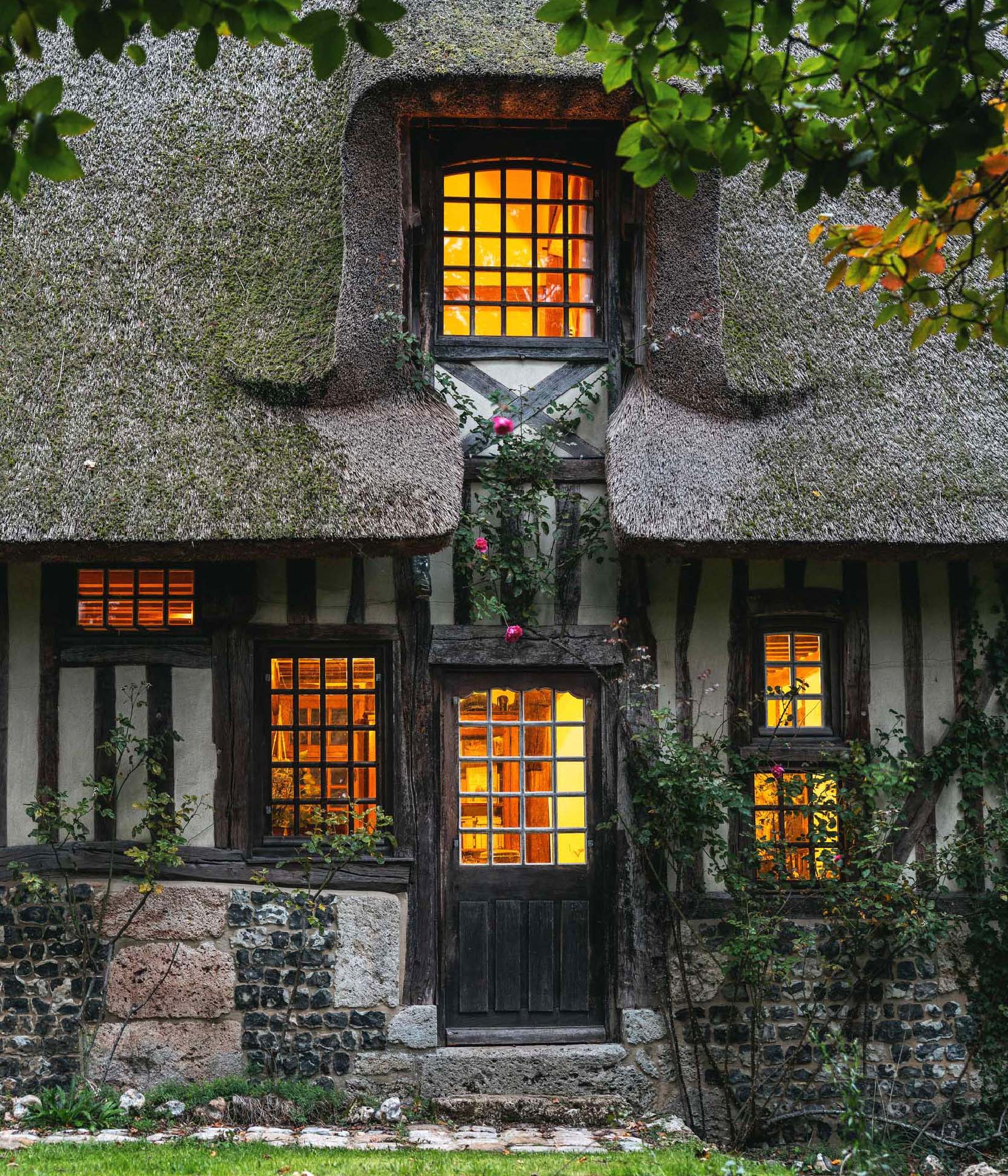
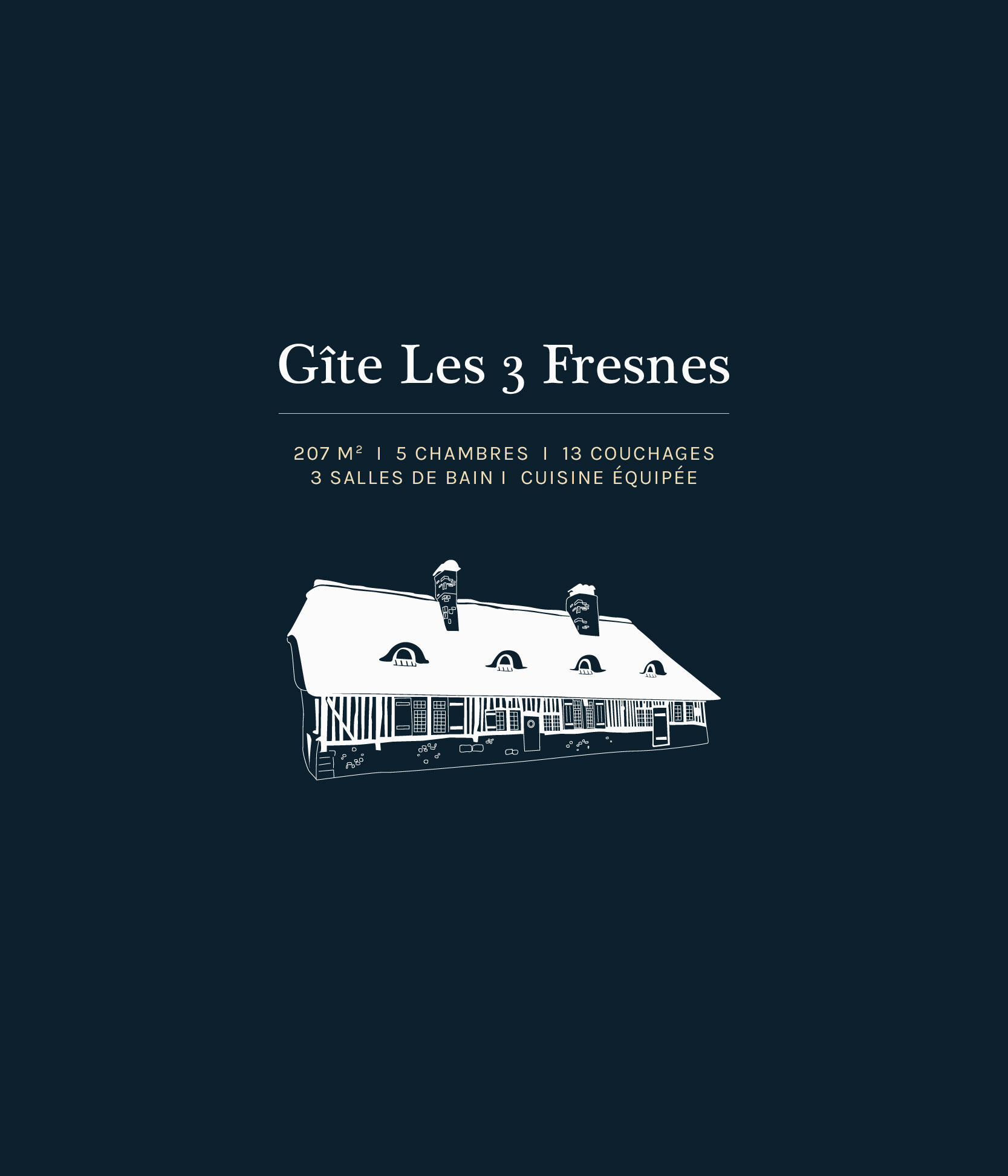
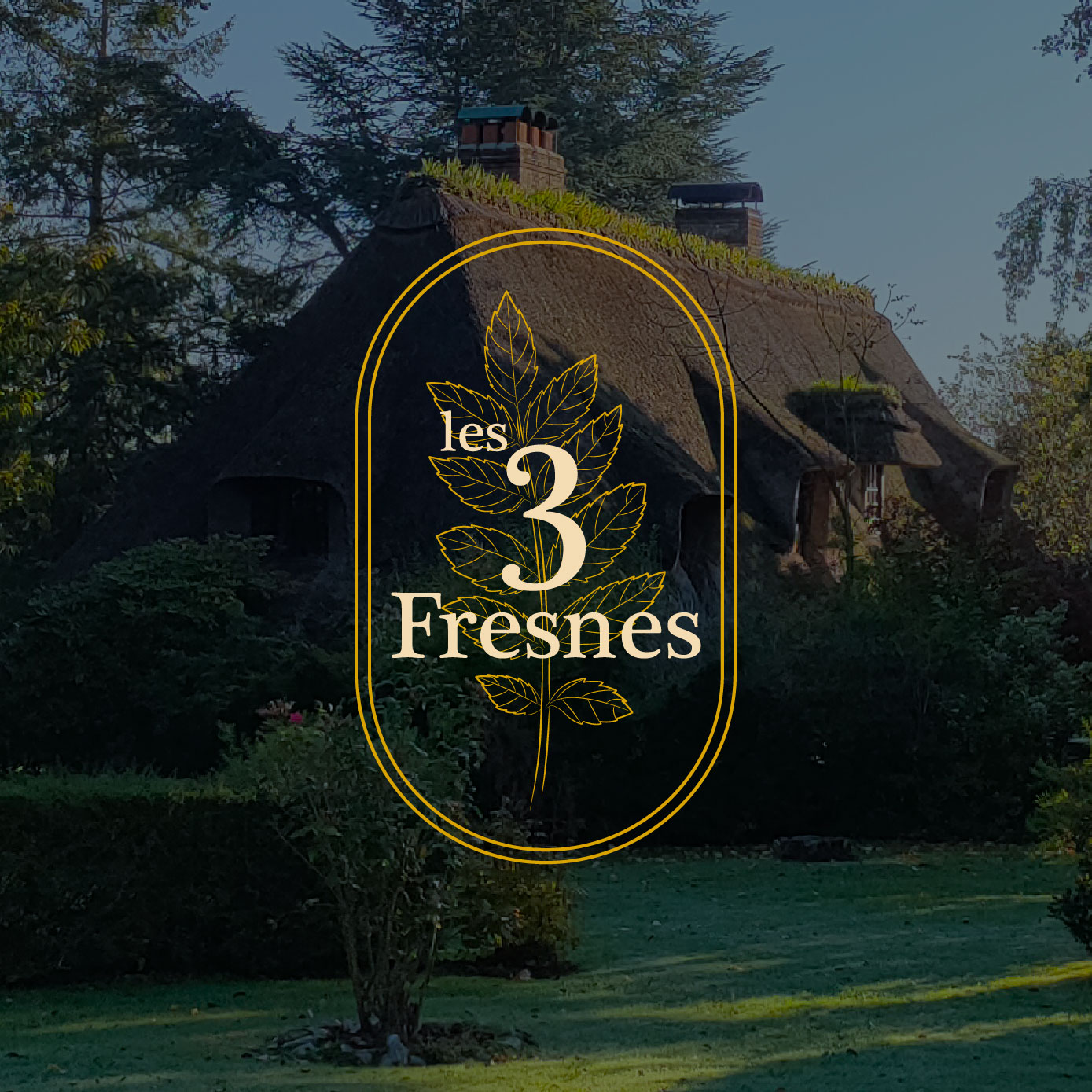
An authentic family thatched cottage in the heart of the Normandy countryside.
Context & Role
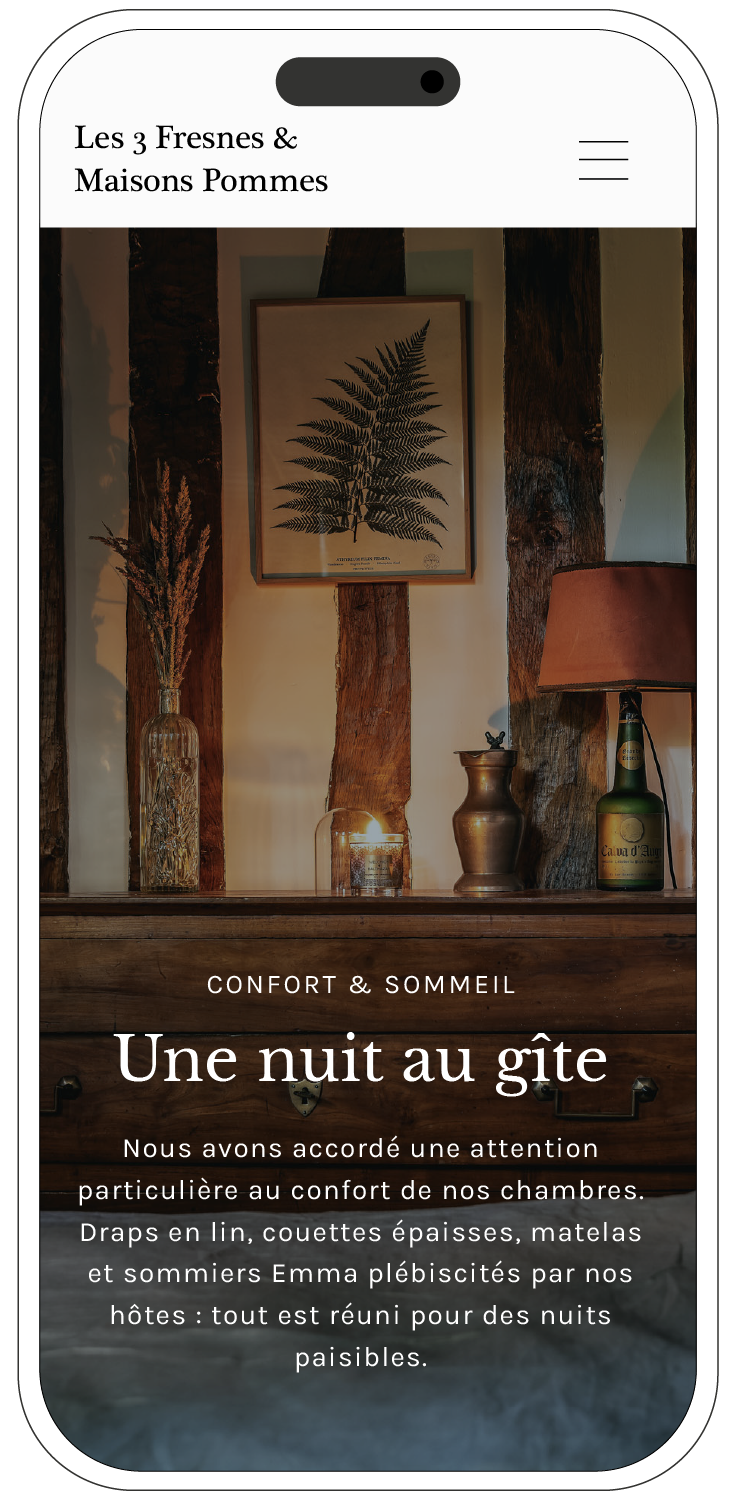
A shared life project led by my partner, restoring his family’s thatched home into a countryside retreat where families and friends can reconnect. My role covered the interiors, branding, and website experience. Now booked year-round, Les 3 Fresnes has become a thriving retreat, paving the way for Maisons Pommes.
Client location France, Normandy
Vincent Varlet Les 3 Fresnes Founder
My Missions
Art direction concept & narrative
Brand system logo, type, color, icons, layout
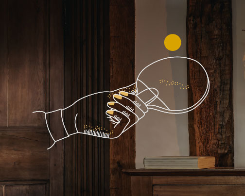
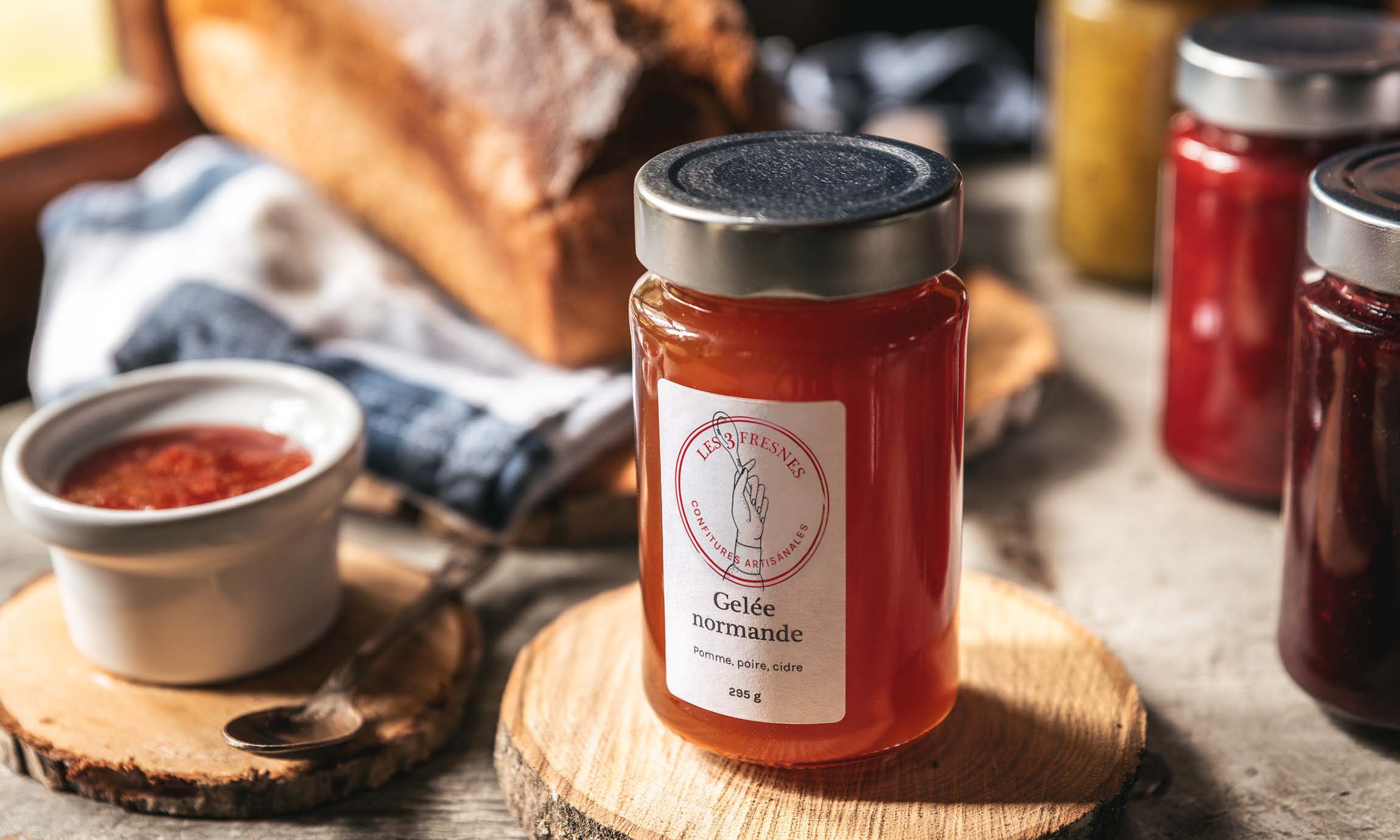
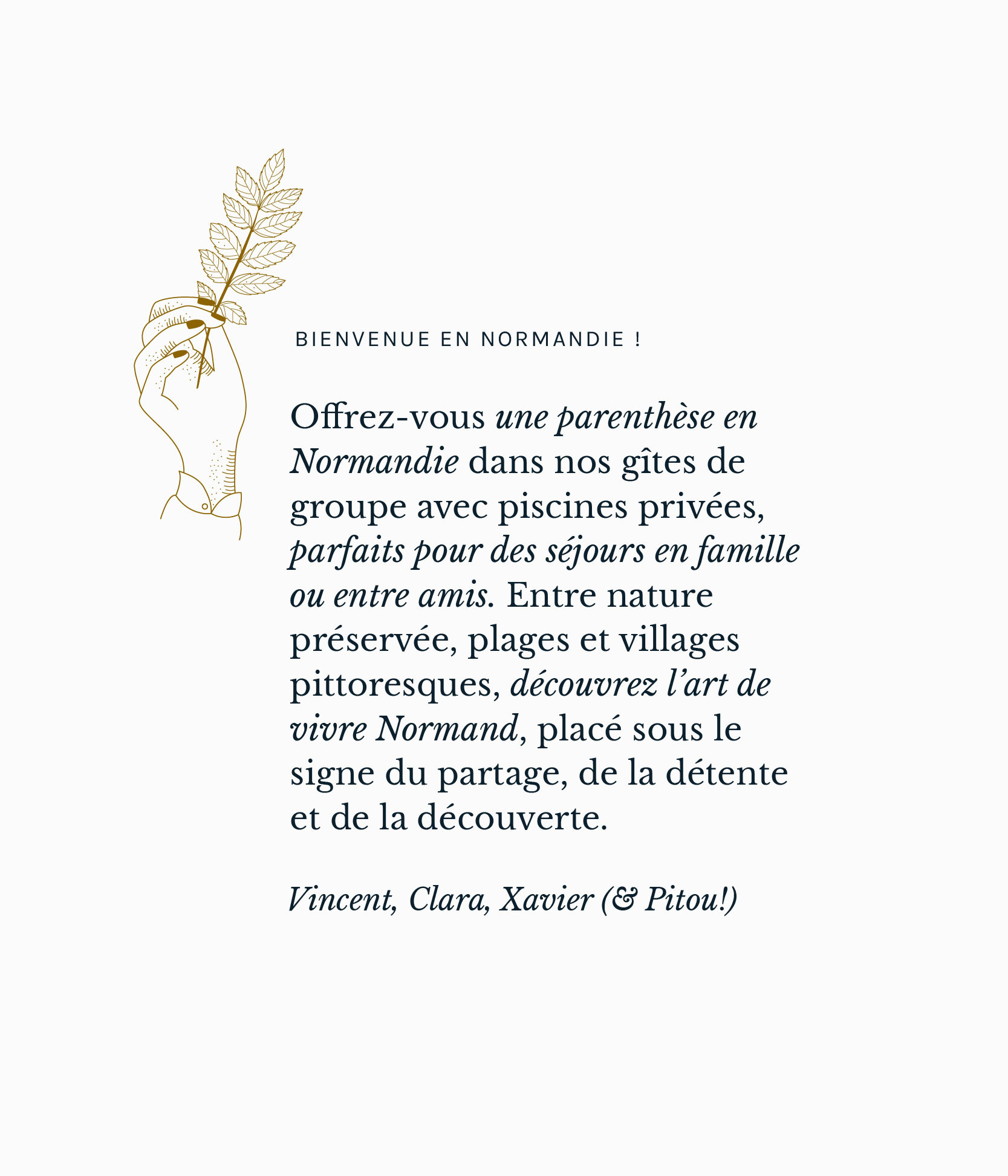
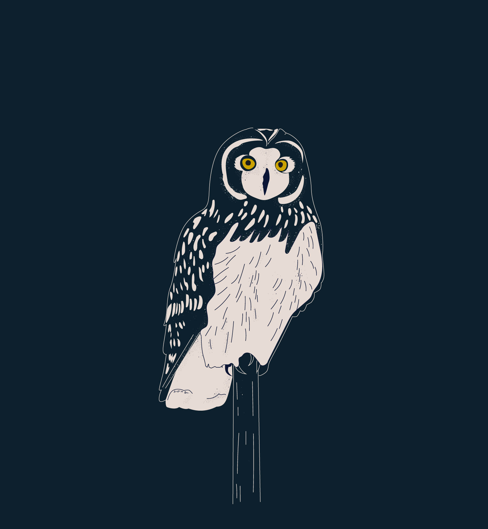
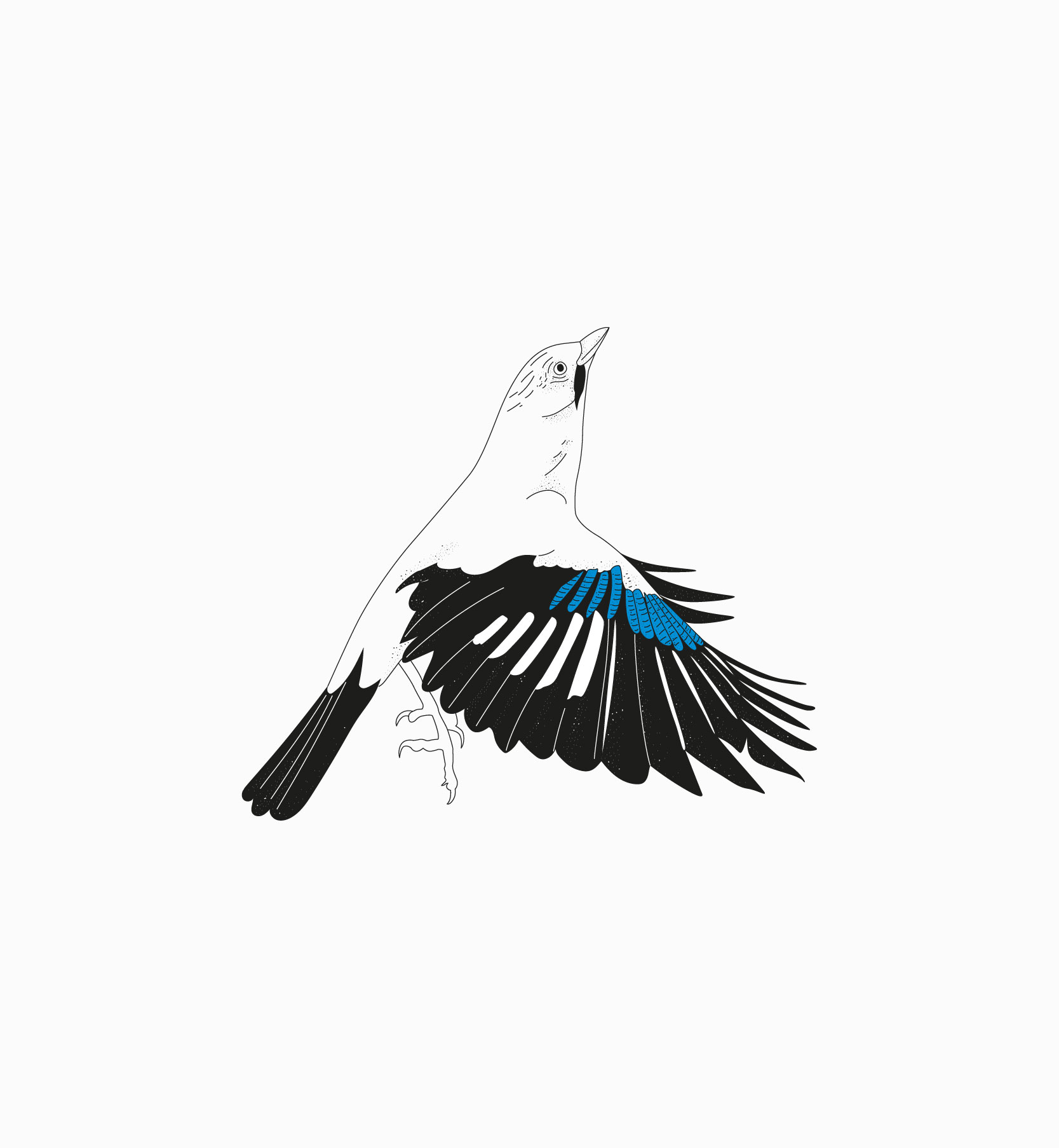
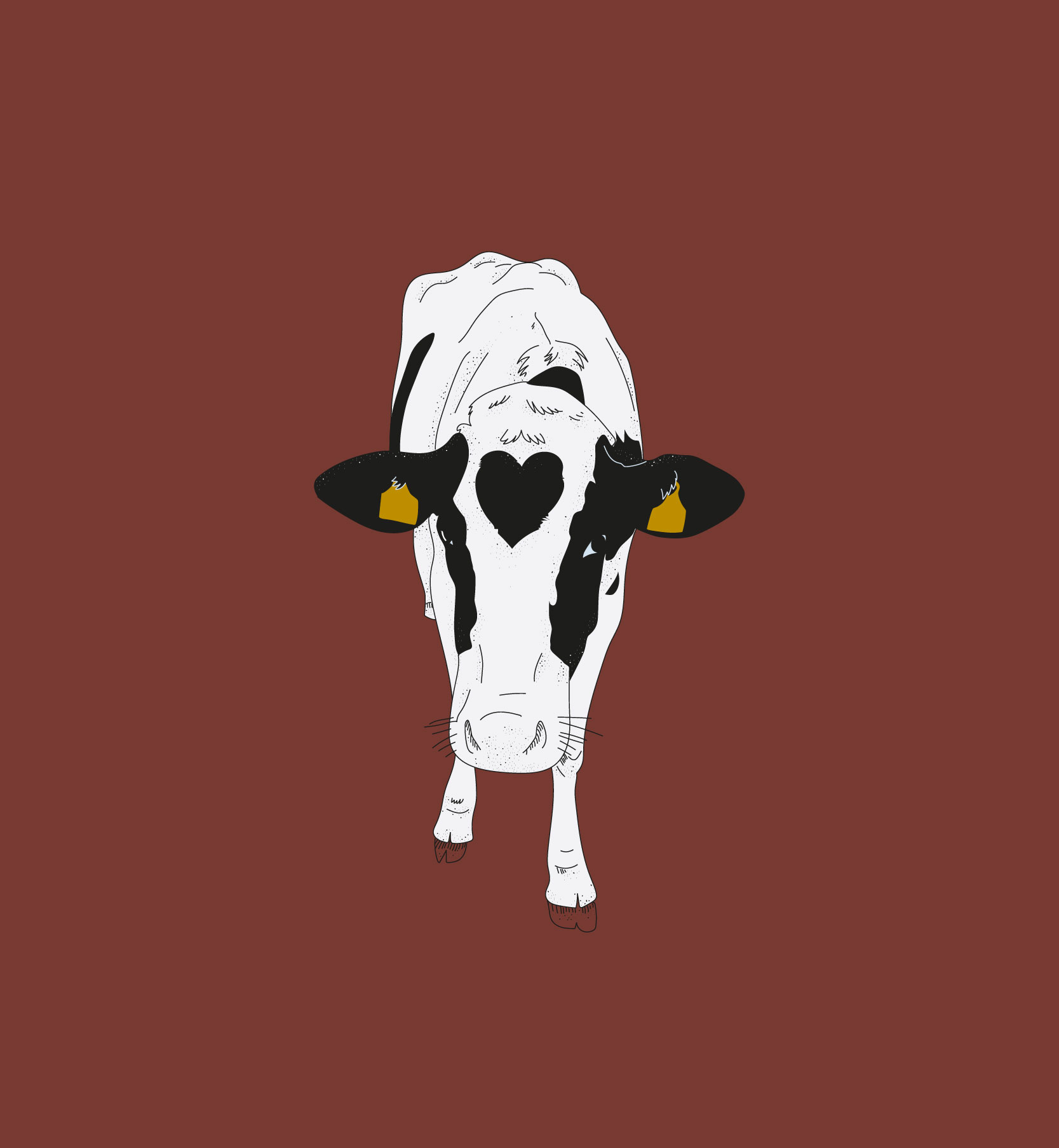
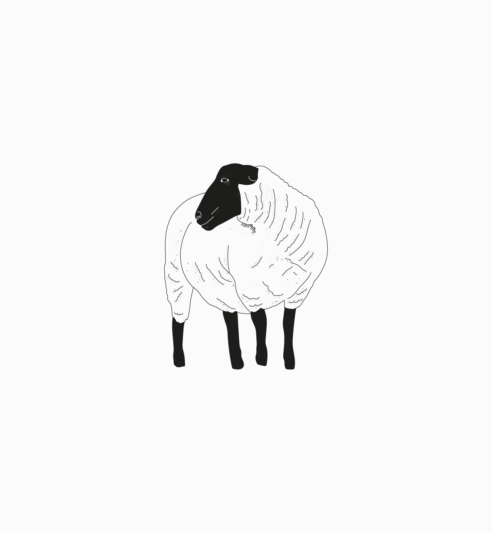
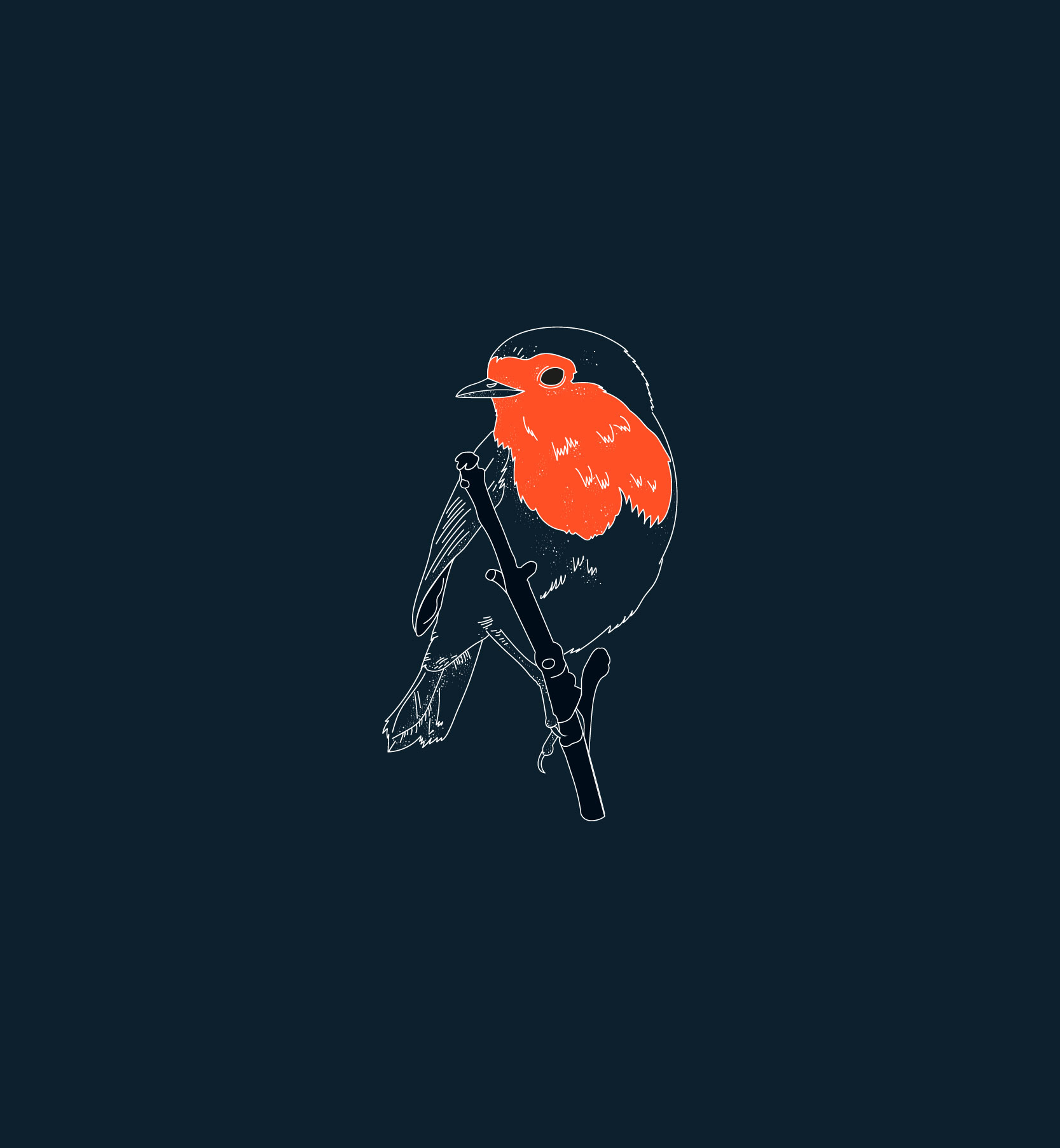
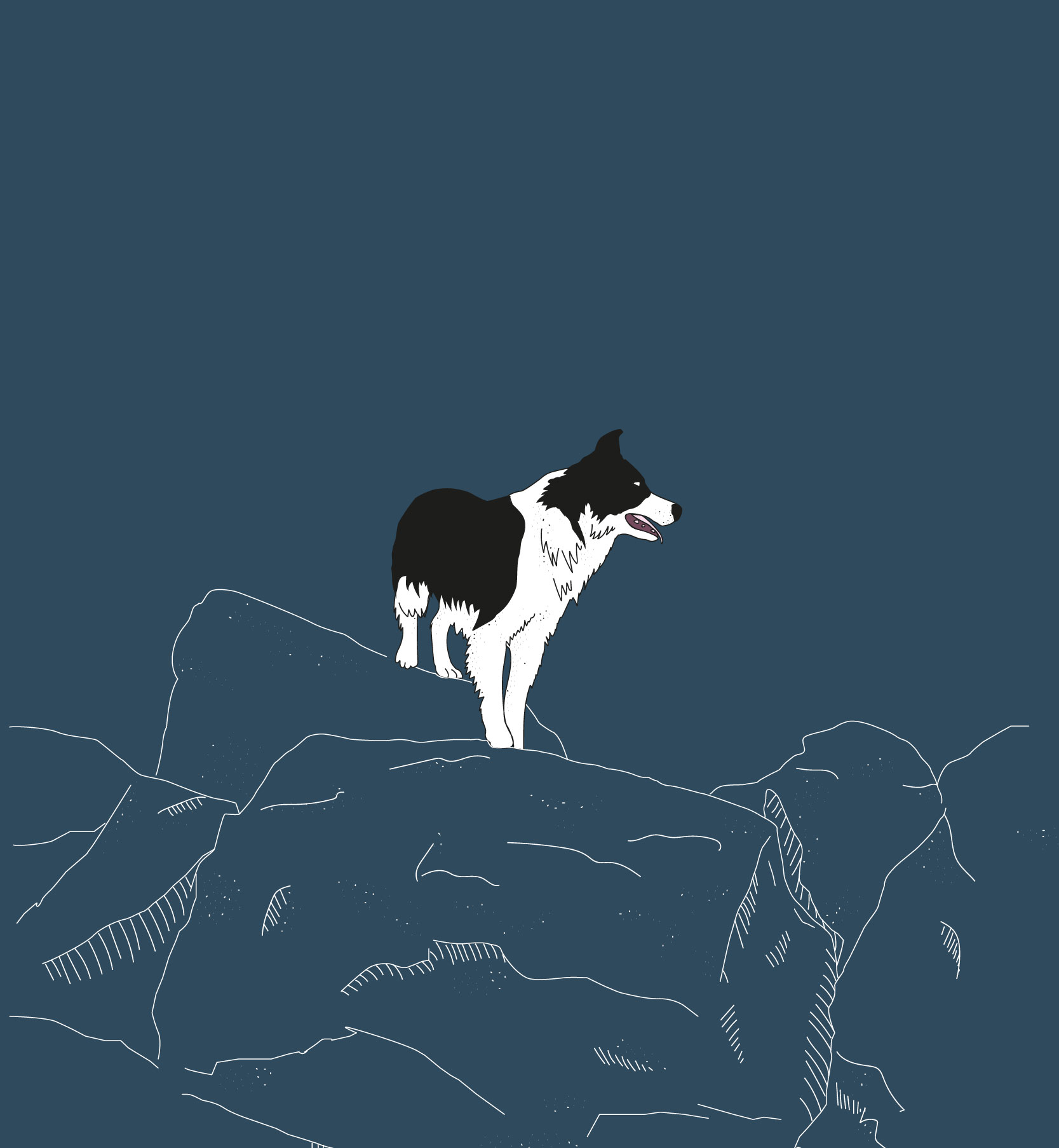
Illustration original artwork created for the website, brochures, and social media
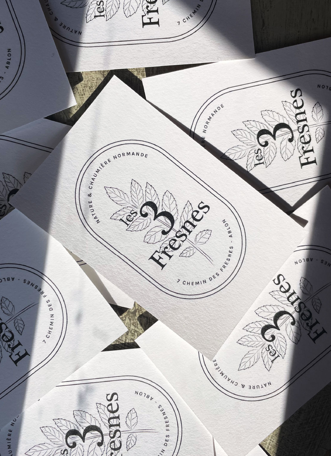
Print design cards, stamp
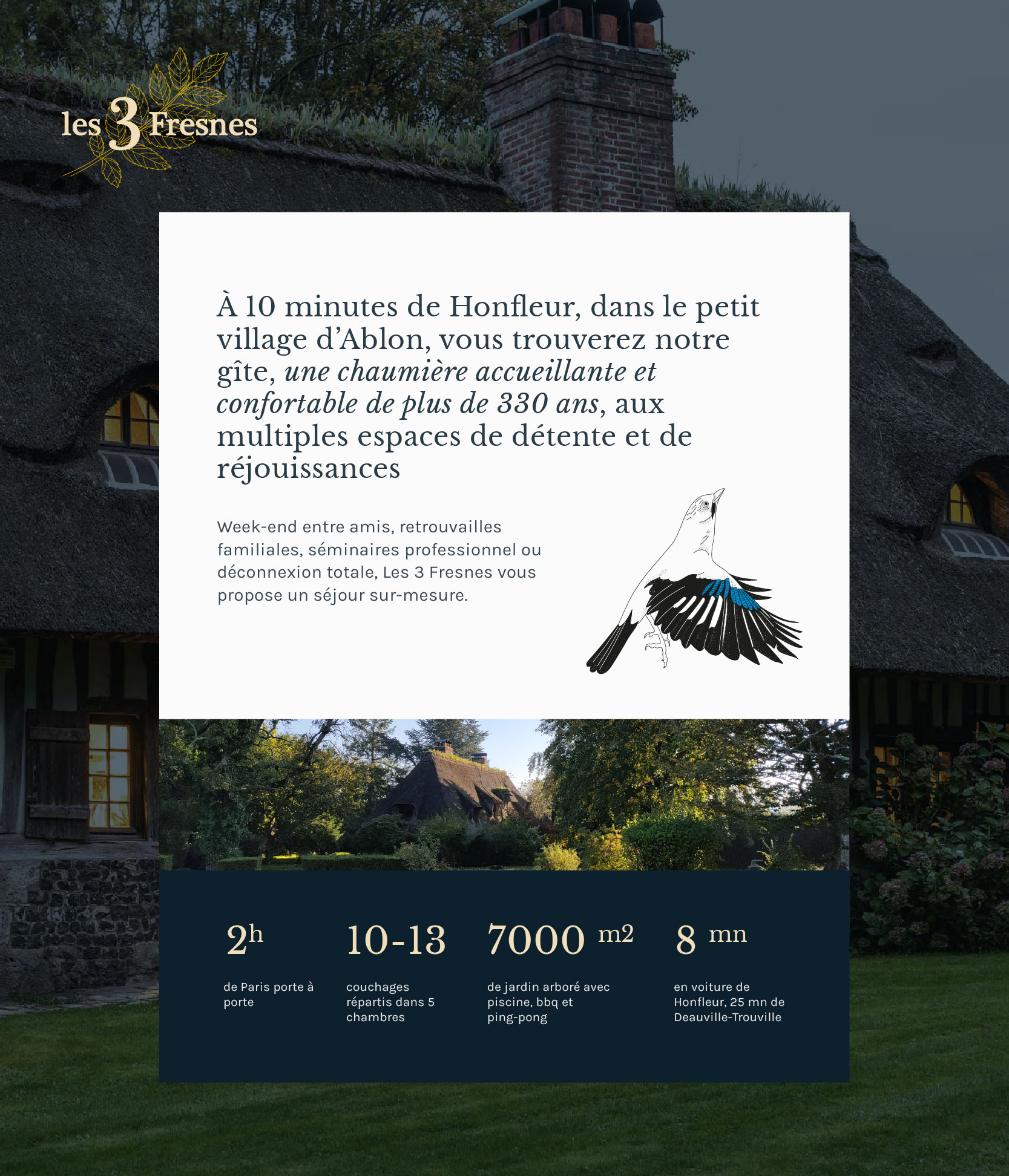
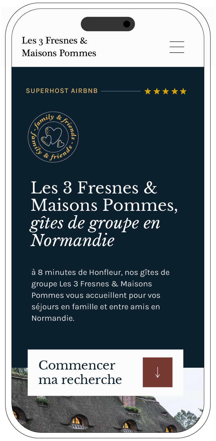
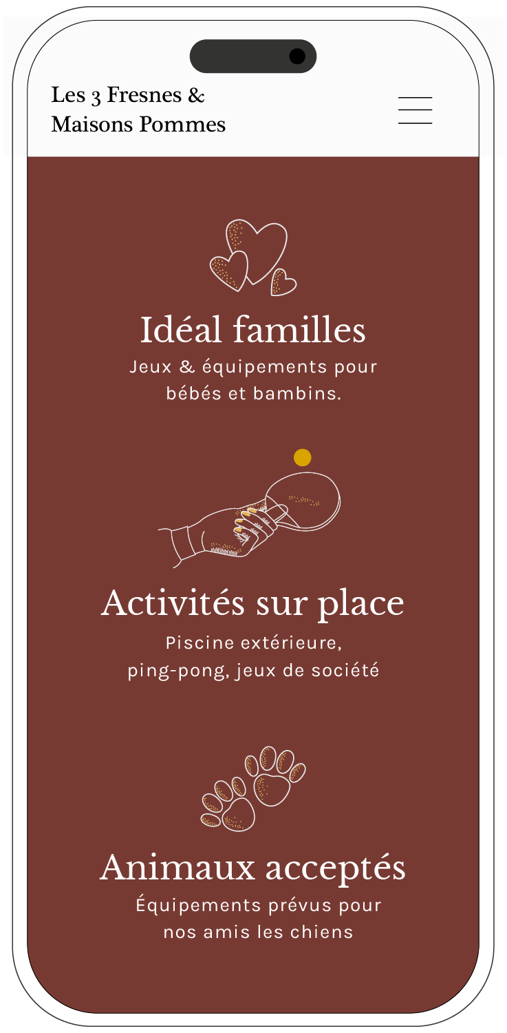
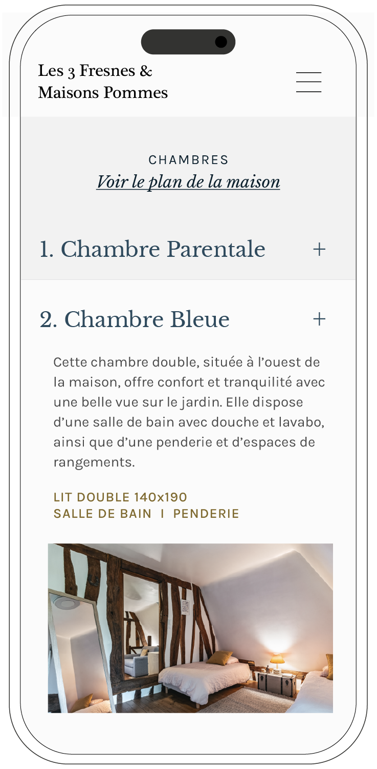
Digital design website, social content
Partners
Photographer Heure.Bleue Studio
Developers Pardos
Print Moo.com
Concept
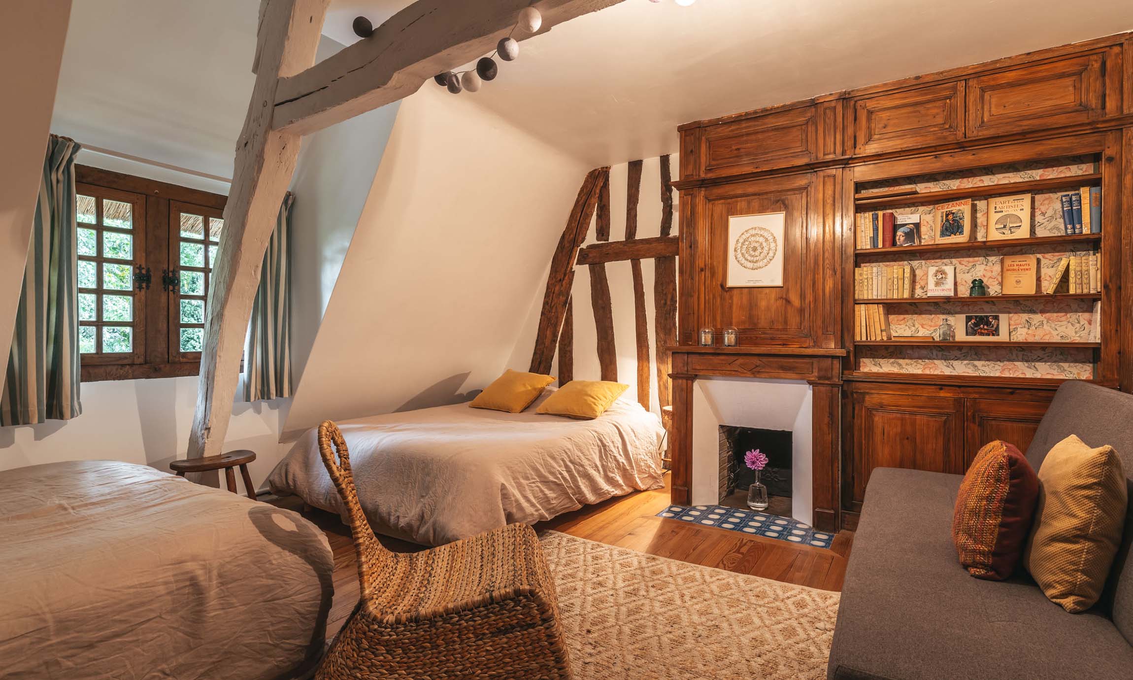
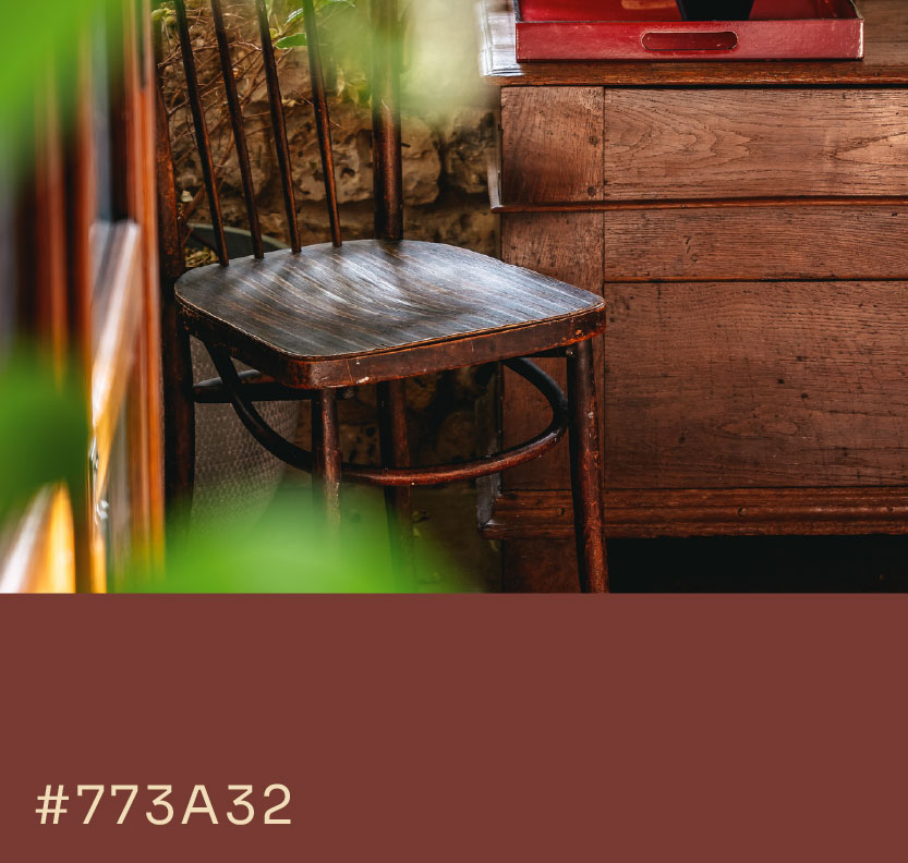
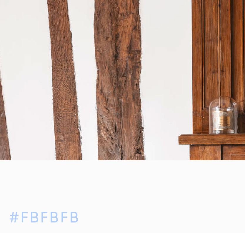
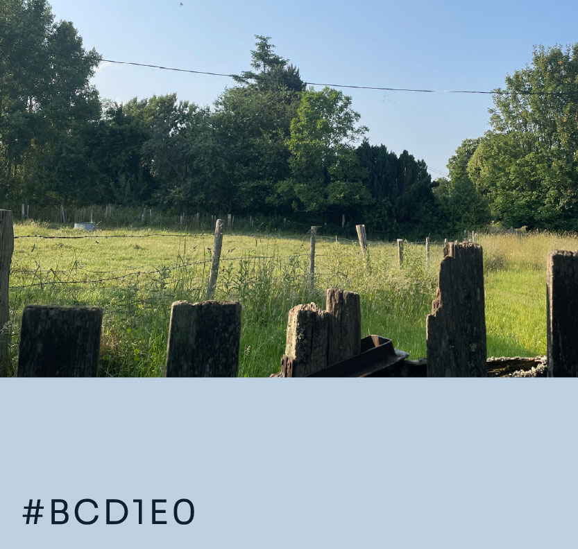
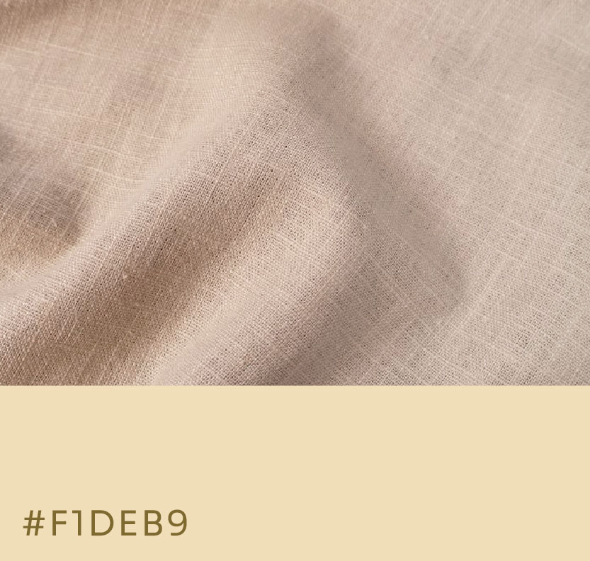
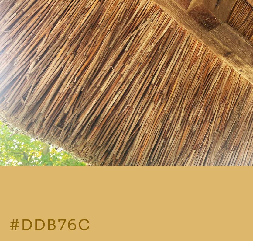
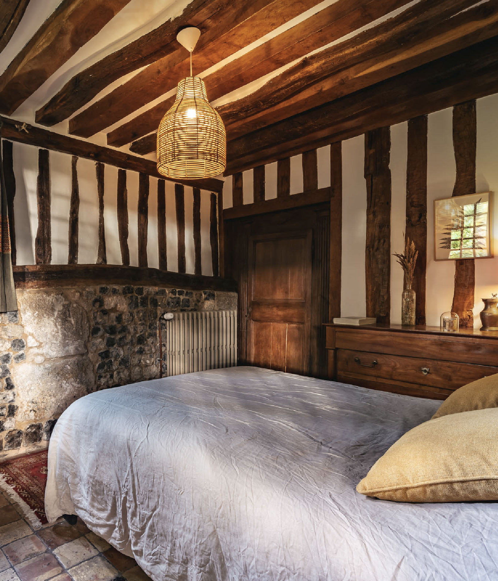
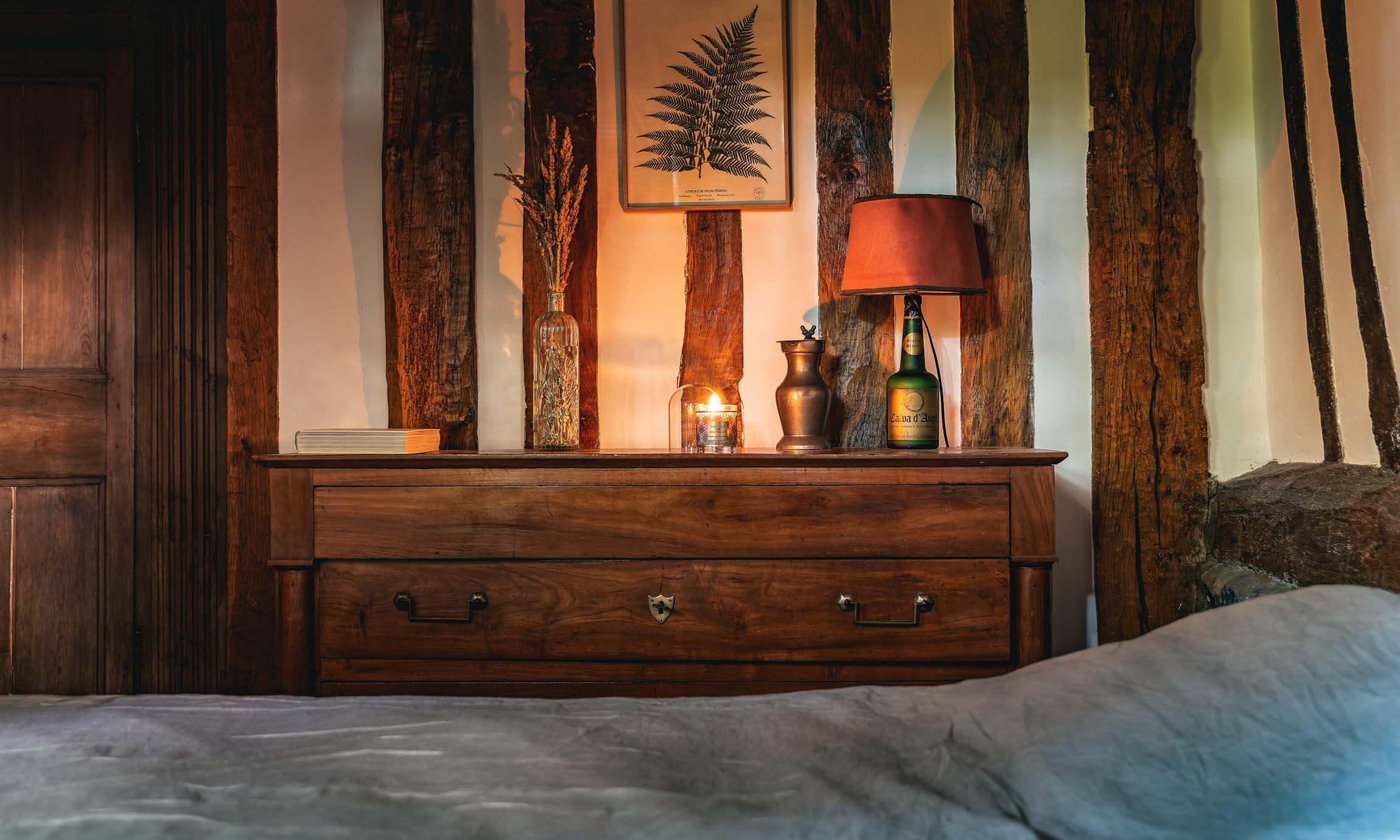
Down a quiet country lane lies a 330-year-old thatched cottage — a refuge where wood, stone, and light meet. Inside, refinement blends with rustic charm: linen, soft light, and the warmth of a home prepared with care. The identity draws from this feeling — a cocoon of quiet beauty. Typography recalls wrought-iron details; the palette echoes wood, plaster, and thatch, celebrating a place where nature and craftsmanship embrace.
Le Gîte
Logotype
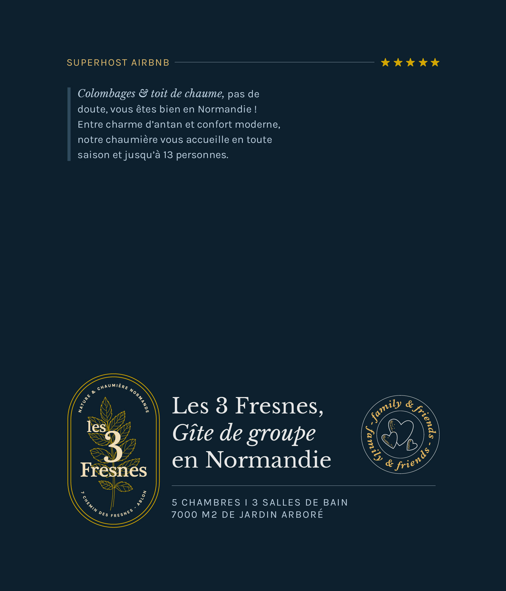
The Oval Cell
Shaped like a keyhole, the form gives the logotype its vertical stance — a gateway that encloses and protects, evoking a feeling of intimacy and quiet retreat from the world.
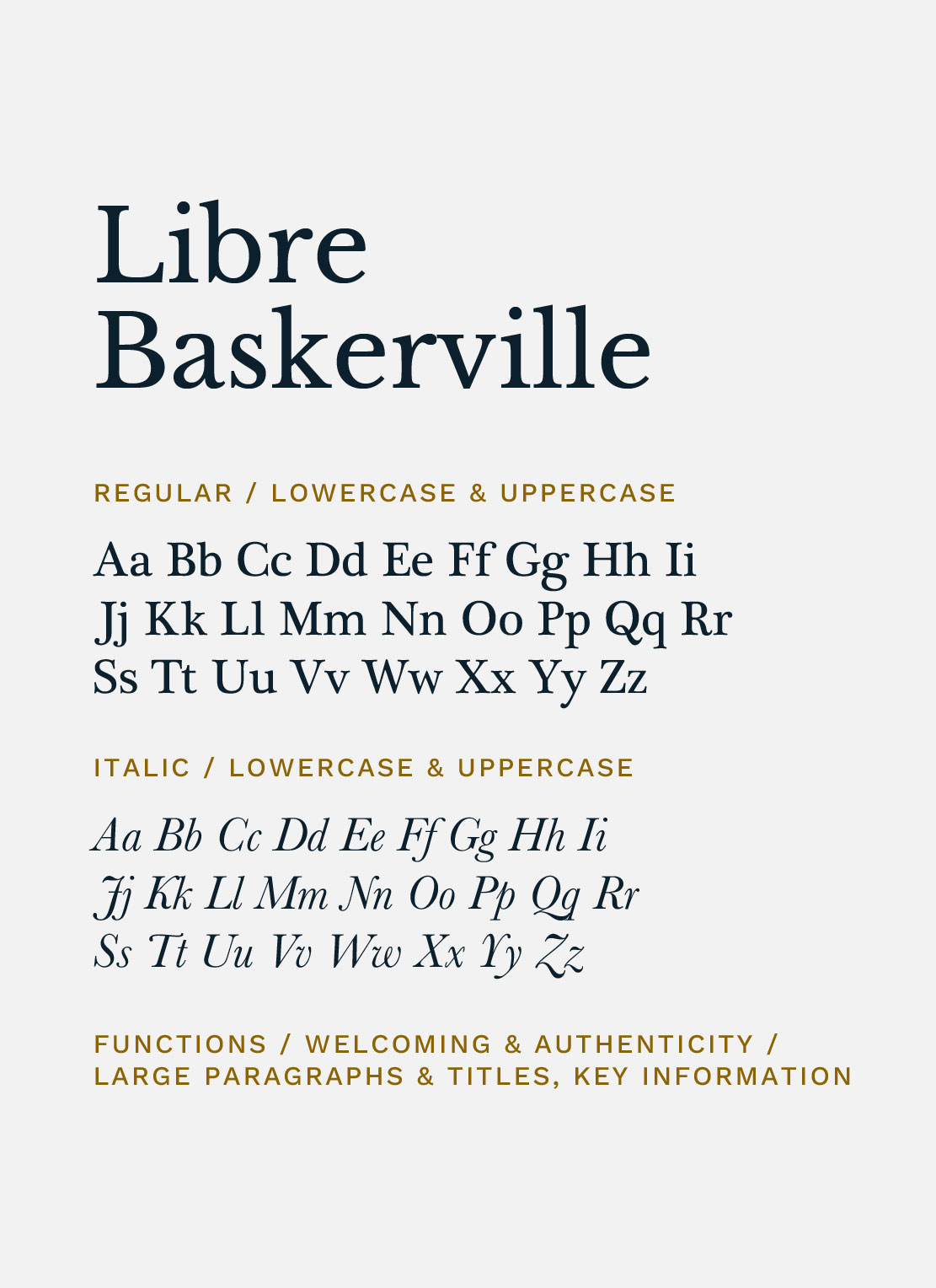
The Typeface
Inspired by the ironwork of old Norman doors, this serif typeface combines organic shapes with a rustic elegance.
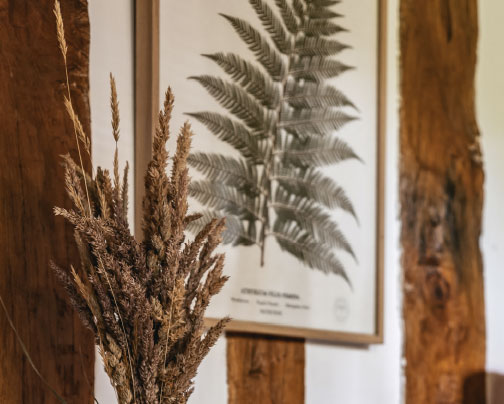
The Ash-Tree Leaf
Drawn with visible veins and fine details, it conveys a sense of texture and life. The ash tree (fresne in Old French) also symbolizes fertility.
Alternatives
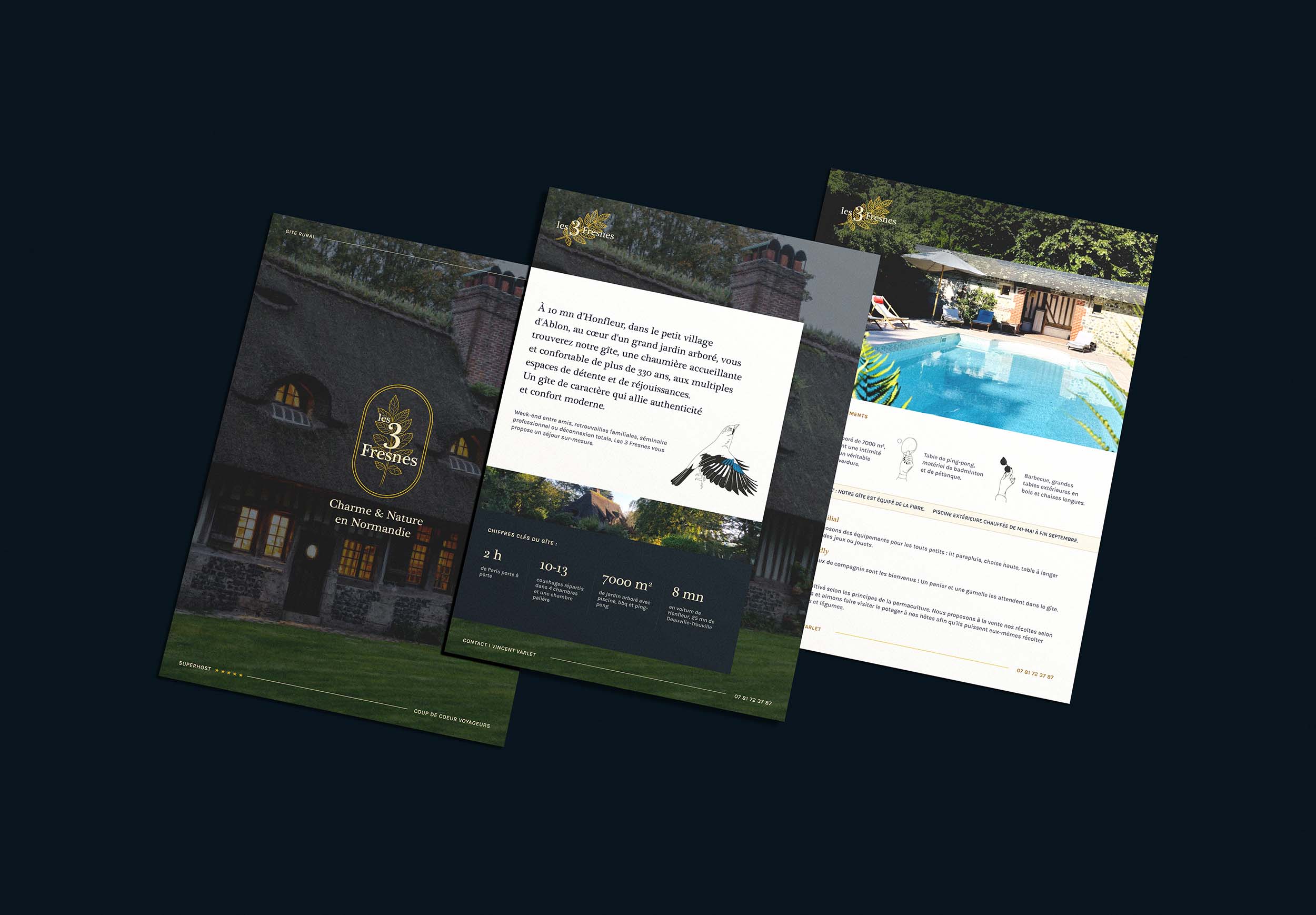
Lighter variations of the main logotype, crafted to adapt gracefully to the different print and digital contexts of the brand’s visual world.
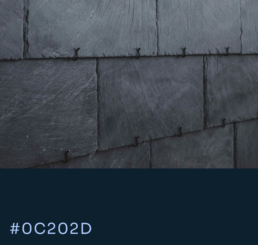
Colors
Icons
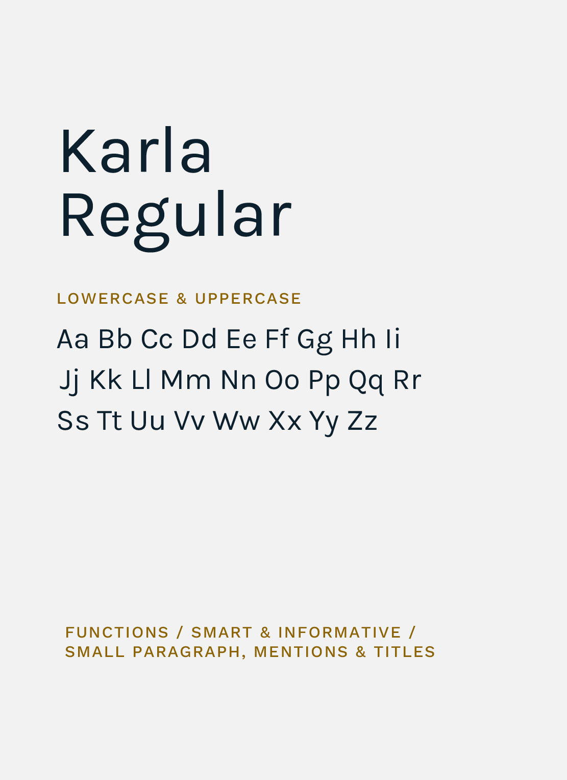
Typography
Layout
Website
Illustrations
Brochure (digital & printable)

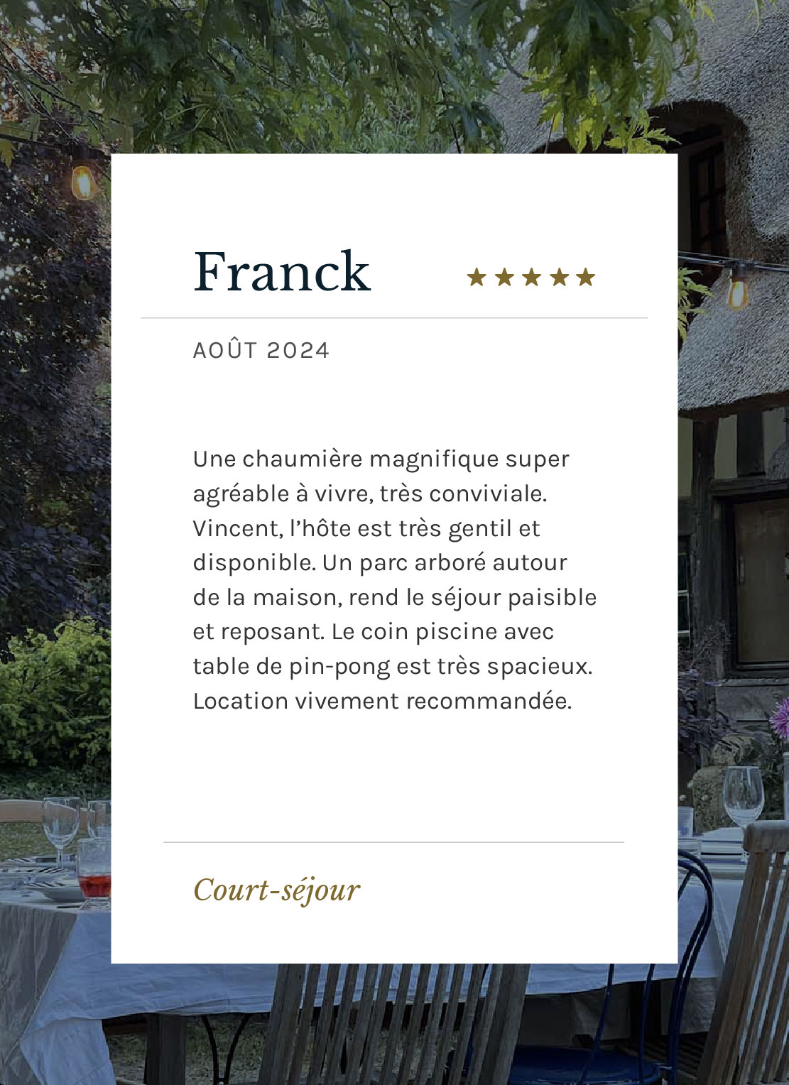
Client's Reviews
"Vision sur le temps long"
"Un travail sur le temps long géré d'une main de maître par Clara qui a su révéler l’âme des 3 Fresnes avec une direction artistique d’une grande sensibilité. Du site à la décoration en passant par les brochures, tout est cohérent, élégant et accueillant. Son travail a joué un rôle clé dans le succès du gîte."
Vincent Varlet
Owner
Projects



Contact
clara lei studio
Working from Normandy, France
Mail → claralei@claraleistudio.com
